Data Visualization Principles

This section covers principles of effective data visualization, including encoding data, including zero when necessary, and techniques for easing comparisons and using color effectively.
Data Visualization
Author

NING LI

Published

Dec 07, 2022

Data Visualization Principles

Overview

Data visualization principles covers some general principles that can serve as guides for effective data visualization.

After completing this section, you will:

  • understand basic principles of effective data visualization.

  • understand the importance of keeping your goal in mind when deciding on a visualization approach.

  • understand principles for encoding data, including position, aligned lengths, angles, area, brightness, and color hue.

  • know when to include the number zero in visualizations.

  • be able to use techniques to ease comparisons, such as using common axes, putting visual cues to be compared adjacent to one another, and using color effectively.

Encoding Data Using Visual Cues

Key Points

  • Visual cues for encoding data include position, length, angle, area, brightness and color hue.

  • Position and length are the preferred way to display quantities, followed by angles, which are preferred over area. Brightness and color are even harder to quantify but can sometimes be useful.

  • Pie charts represent visual cues as both angles and area, while donut charts use only area. Humans are not good at visually quantifying angles and are even worse at quantifying area. Therefore pie and donut charts should be avoided - use a bar plot instead. If you must make a pie chart, include percentages as labels.

  • Bar plots represent visual cues as position and length. Humans are good at visually quantifying linear measures, making bar plots a strong alternative to pie or donut charts.

Know when to Include Zero

Key Points

  • When using bar plots, always start at 0. It is deceptive not to start at 0 because bar plots imply length is proportional to the quantity displayed. Cutting off the y-axis can make differences look bigger than they actually are.

  • When using position rather than length, it is not necessary to include 0 (scatterplot, dot plot, boxplot).

Do not Distort Quantitles

Key Points

  • Make sure your visualizations encode the correct quantities.

  • For example, if you are using a plot that relies on circle area, make sure the area (rather than the radius) is proportional to the quantity.

Order by a Meaningful Value

Key Points

  • It is easiest to visually extract information from a plot when categories are ordered by a meaningful value. The exact value on which to order will depend on your data and the message you wish to convey with your plot.

  • The default ordering for categories is alphabetical if the categories are strings or by factor level if factors. However, we rarely want alphabetical order.

Show the Data

Key Points

  • A dynamite plot - a bar graph of group averages with error bars denoting standard errors - provides almost no information about a distribution.

  • By showing the data, you provide viewers extra information about distributions.

  • Jitter is adding a small random shift to each point in order to minimize the number of overlapping points. To add jitter, use the geom_jitter() geometry instead of geom_point(). (See example below.)

  • Alpha blending is making points somewhat transparent, helping visualize the density of overlapping points. Add an alpha argument to the geometry.

Code

── Attaching core tidyverse packages ──────────────────────── tidyverse 2.0.0 ──
✔ dplyr     1.1.2     ✔ readr     2.1.4
✔ forcats   1.0.0     ✔ stringr   1.5.0
✔ ggplot2   3.4.2     ✔ tibble    3.2.1
✔ lubridate 1.9.2     ✔ tidyr     1.3.0
✔ purrr     1.0.1     
── Conflicts ────────────────────────────────────────── tidyverse_conflicts() ──
✖ dplyr::filter() masks stats::filter()
✖ dplyr::lag()    masks stats::lag()
ℹ Use the conflicted package (<http://conflicted.r-lib.org/>) to force all conflicts to become errors
library(dslabs)
data(heights)
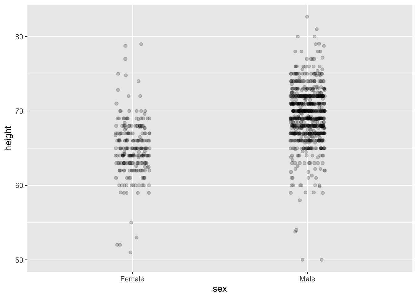
# dot plot showing the data
heights %>% ggplot(aes(sex, height)) + geom_point()

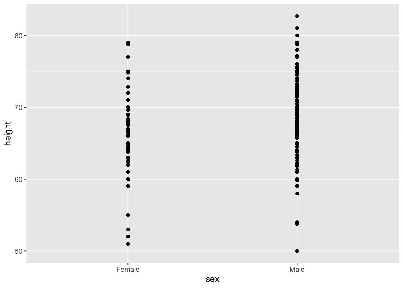
# jittered, alpha blended point plot
heights %>% ggplot(aes(sex, height)) + geom_jitter(width = 0.1, alpha = 0.2)

Ease Comparisons: Use Common Axes

Key Points

  • Ease comparisons by keeping axes the same when comparing data across multiple plots.

  • Align plots vertically to see horizontal changes. Align plots horizontally to see vertical changes.

  • Bar plots are useful for showing one number but not useful for showing distributions.

Consider Transformations

Key Points

  • Use transformations when warranted to ease visual interpretation.

  • The log transformation is useful for data with multiplicative changes. The logistic transformation is useful for fold changes in odds. The square root transformation is useful for count data.

Ease Comparisons: Compared Visual Cues Should Be Adjacent

Key Points

  • When two groups are to be compared, it is optimal to place them adjacent in the plot.

  • Use color to encode groups to be compared.

  • Consider using a color blind friendly palette.

Code

color_blind_friendly_cols <- c("#999999", "#E69F00", "#56B4E9", "#009E73", "#F0E442", "#0072B2", "#D55E00", "#CC79A7")

p1 <- data.frame(x = 1:8, y = 1:8, col = as.character(1:8)) %>%
    ggplot(aes(x, y, color = col)) +
    geom_point(size = 5)
p1 + scale_color_manual(values = color_blind_friendly_cols)

Slope Charts

Key Points

  • Consider using a slope chart or Bland-Altman plot when comparing one variable at two different time points, especially for a small number of observations.

  • Slope charts use angle to encode change. Use geom_line() to create slope charts. It is useful when comparing a small number of observations.

  • The Bland-Altman plot (Tukey mean difference plot, MA plot) graphs the difference between conditions on the y-axis and the mean between conditions on the x-axis. It is more appropriate for large numbers of observations than slope charts.

Code: Slope chart

library(tidyverse)
library(dslabs)
data(gapminder)
west <- c("Western Europe", "Northern Europe", "Southern Europe", "Northern America", "Australia and New Zealand")

dat <- gapminder %>%
    filter(year %in% c(2010, 2015) & region %in% west & !is.na(life_expectancy) & population > 10^7)

dat %>%
    mutate(location = ifelse(year == 2010, 1, 2),
           location = ifelse(year == 2015 & country %in% c("United Kingdom", "Portugal"),
                             location + 0.22, location),
           hjust = ifelse(year == 2010, 1, 0)) %>%
    mutate(year = as.factor(year)) %>%
    ggplot(aes(year, life_expectancy, group = country)) +
    geom_line(aes(color = country), show.legend = FALSE) +
    geom_text(aes(x = location, label = country, hjust = hjust), show.legend = FALSE) +
    xlab("") +
    ylab("Life Expectancy") 

Code: Bland-Altman Plot

dat %>%
    mutate(year = paste0("life_expectancy_", year)) %>%
    select(country, year, life_expectancy) %>% spread(year, life_expectancy) %>%
    mutate(average = (life_expectancy_2015 + life_expectancy_2010)/2,
                difference = life_expectancy_2015 - life_expectancy_2010) %>%
    ggplot(aes(average, difference, label = country)) +
    geom_point() +
    geom_text_repel() +
    geom_abline(lty = 2) +
    xlab("Average of 2010 and 2015") +
    ylab("Difference between 2015 and 2010")

Encoding a Third Variable

Key Points

  • Encode a categorical third variable on a scatterplot using color hue or shape. Use the shape argument to control shape.

  • Encode a continuous third variable on a using color intensity or size.

Case Study: Vaccines

Key Points

  • Vaccines save millions of lives, but misinformation has led some to question the safety of vaccines. The data support vaccines as safe and effective. We visualize data about measles incidence in order to demonstrate the impact of vaccination programs on disease rate.

  • The RColorBrewer package offers several color palettes. Sequential color palettes are best suited for data that span from high to low. Diverging color palettes are best suited for data that are centered and diverge towards high or low values.

  • The geom_tile() geometry creates a grid of colored tiles. Position and length are stronger cues than color for numeric values, but color can be appropriate sometimes.

Code: Tile plot of measles rate by year and state

# import data and inspect
library(tidyverse)
library(dslabs)
data(us_contagious_diseases)
str(us_contagious_diseases)
# assign dat to the per 10,000 rate of measles, removing Alaska and Hawaii and adjusting for weeks reporting
the_disease <- "Measles"
dat <- us_contagious_diseases %>%
    filter(!state %in% c("Hawaii", "Alaska") & disease == the_disease) %>%
    mutate(rate = count / population * 10000 * 52/weeks_reporting) %>%
    mutate(state = reorder(state, rate))

# plot disease rates per year in California
dat %>% filter(state == "California" & !is.na(rate)) %>%
    ggplot(aes(year, rate)) +
    geom_line() +
    ylab("Cases per 10,000") +
    geom_vline(xintercept=1963, col = "blue")

# tile plot of disease rate by state and year
dat %>% ggplot(aes(year, state, fill=rate)) +
    geom_tile(color = "grey50") +
    scale_x_continuous(expand = c(0,0)) +
    scale_fill_gradientn(colors = RColorBrewer::brewer.pal(9, "Reds"), trans = "sqrt") +
    geom_vline(xintercept = 1963, col = "blue") +
    theme_minimal() + theme(panel.grid = element_blank()) +
    ggtitle(the_disease) +
    ylab("") +
    xlab("")

Code: Line plot of measles rate by year and state

# compute US average measles rate by year
avg <- us_contagious_diseases %>%
    filter(disease == the_disease) %>% group_by(year) %>%
    summarize(us_rate = sum(count, na.rm = TRUE)/sum(population, na.rm = TRUE)*10000)

# make line plot of measles rate by year by state
dat %>%
    filter(!is.na(rate)) %>%
    ggplot() +
    geom_line(aes(year, rate, group = state), color = "grey50", 
        show.legend = FALSE, alpha = 0.2, size = 1) +
    geom_line(mapping = aes(year, us_rate), data = avg, size = 1, col = "black") +
    scale_y_continuous(trans = "sqrt", breaks = c(5, 25, 125, 300)) +
    ggtitle("Cases per 10,000 by state") +
    xlab("") +
    ylab("") +
    geom_text(data = data.frame(x = 1955, y = 50),
        mapping = aes(x, y, label = "US average"), color = "black") +
    geom_vline(xintercept = 1963, col = "blue")

Avoid Pseudo and Gratuitous 3D Plots

Key Points

In general, pseudo-3D plots and gratuitous 3D plots only add confusion. Use regular 2D plots instead.

Avoid Too Many Significant Digits

Key points

  • In tables, avoid using too many significant digits. Too many digits can distract from the meaning of your data.

  • Reduce the number of significant digits globally by setting an option. For example, options(digits = 3) will cause all future computations that session to have 3 significant digits.

  • Reduce the number of digits locally using round() or signif().

Back to top