Gapminder
Overview
After completing Gapminder, you will: - understand how Hans Rosling and the Gapminder Foundation use effective data visualization to convey data-based trends.
be able to apply the ggplot2 techniques from the previous section to answer questions using data.
understand how fixed scales across plots can ease comparisons.
be able to modify graphs to improve data visualization.
Introduction to Gapminder
Case study: Trends in World Health and Economics
Data Source form Gapminder
We will use this data to answer the following questions about World Health and Economics: - Is it still fair to consider the world as divided into the West and the developing world? - Has income inequality across countries worsened over the last 40 years?
Gapminder Dataset
Key Points
A selection of world health and economics statistics from the Gapminder project can be found in the
dslabspackage as data(gapminder).Most people have misconceptions about world health and economics, which can be addressed by considering real data.
Code
head(gapminder) country year infant_mortality life_expectancy fertility
1 Albania 1960 115.40 62.87 6.19
2 Algeria 1960 148.20 47.50 7.65
3 Angola 1960 208.00 35.98 7.32
4 Antigua and Barbuda 1960 NA 62.97 4.43
5 Argentina 1960 59.87 65.39 3.11
6 Armenia 1960 NA 66.86 4.55
population gdp continent region
1 1636054 NA Europe Southern Europe
2 11124892 13828152297 Africa Northern Africa
3 5270844 NA Africa Middle Africa
4 54681 NA Americas Caribbean
5 20619075 108322326649 Americas South America
6 1867396 NA Asia Western Asianames(gapminder)[1] "country" "year" "infant_mortality" "life_expectancy"
[5] "fertility" "population" "gdp" "continent"
[9] "region" Life Expectancy and Fertility Rates
Key Points
-
A prevalent worldview is that the world is divided into two groups of countries:
Western world: high life expectancy, low fertility rate
Developing world: lower life expectancy, higher fertility rate
Gapminder data can be used to evaluate the validity of this view.
A scatterplot of life expectancy versus fertility rate in 1962 suggests that this viewpoint was grounded in reality 50 years ago. Is it still the case today?
Code
# basic scatterplot of life expectancy versus fertility
ds_theme_set() # set plot theme
filter(gapminder, year == 1962) %>%
  ggplot(aes(fertility, life_expectancy)) +
  geom_point()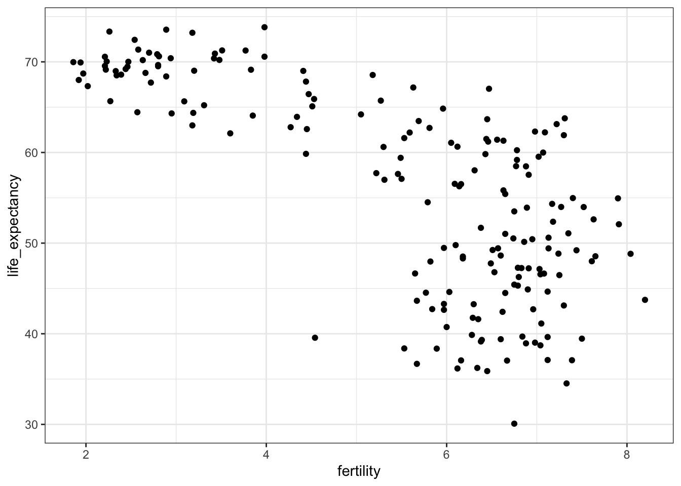
# add color as continent
filter(gapminder, year == 1962) %>%
  ggplot(aes(fertility, life_expectancy, color = continent)) +
  geom_point()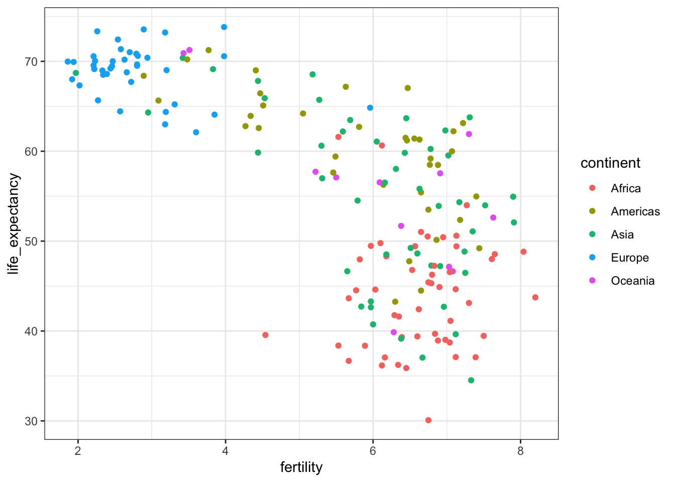
Faceting
Key Points
Faceting makes multiple side-by-side plots stratified by some variable. This is a way to ease comparisons.
The
facet_grid()function allows faceting by up to two variables, with rows faceted by one variable and columns faceted by the other variable. To facet by only one variable, use the dot operator as the other variable.The
facet_wrap()function facets by one variable and automatically wraps the series of plots so they have readable dimensions.Faceting keeps the axes fixed across all plots, easing comparisons between plots.
The data suggest that the developing versus Western world view no longer makes sense in 2012.
Code
# facet by continent and year
filter(gapminder, year %in% c(1962, 2012)) %>%
  ggplot(aes(fertility, life_expectancy, col = continent)) +
  geom_point() +
  facet_grid(continent ~ year)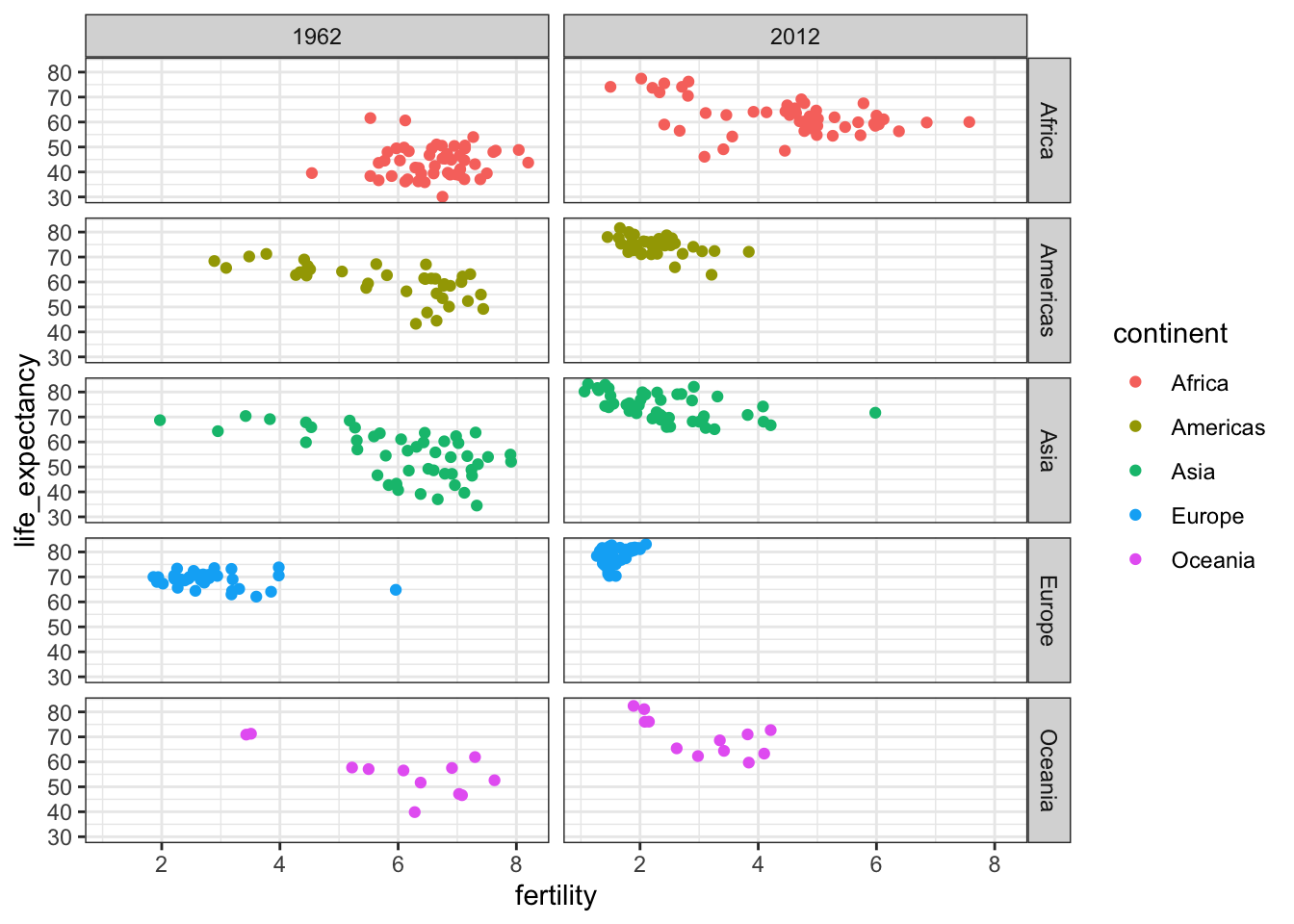
# facet by year only
filter(gapminder, year %in% c(1962, 2012)) %>%
  ggplot(aes(fertility, life_expectancy, col = continent)) +
  geom_point() +
  facet_grid(. ~ year)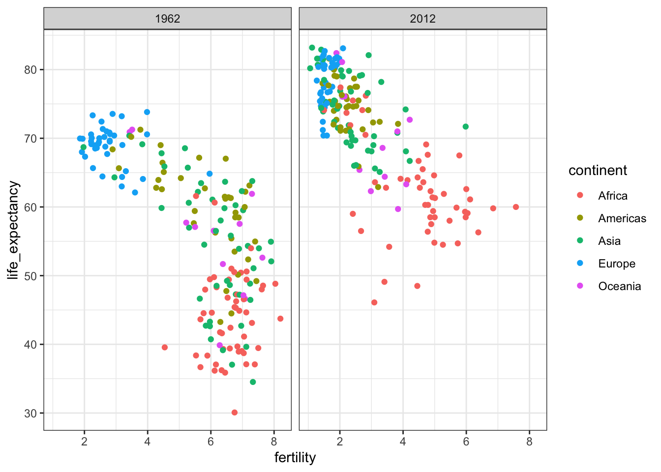
# facet by year, plots wrapped onto multiple rows
years <- c(1962, 1980, 1990, 2000, 2012)
continents <- c("Europ", "Asia")
gapminder %>%
  filter(year %in% years & continent %in% continent) %>%
  ggplot(aes(fertility, life_expectancy, col = continent)) +
  geom_point() +
  facet_wrap(. ~ year)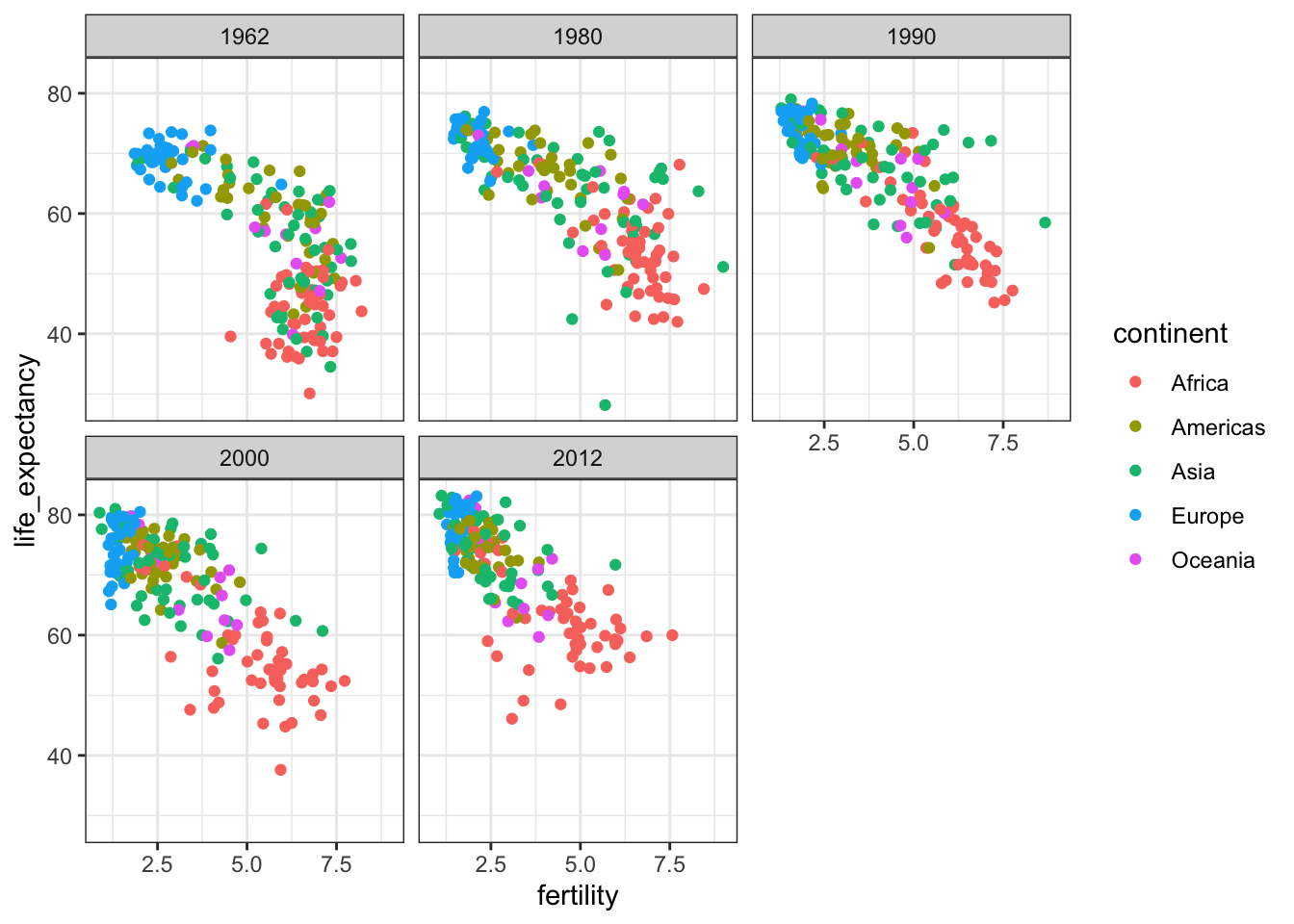
Time Series Plots
Key Points
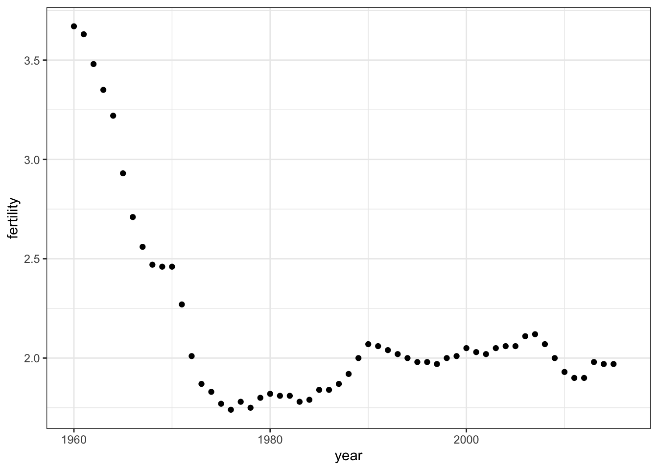
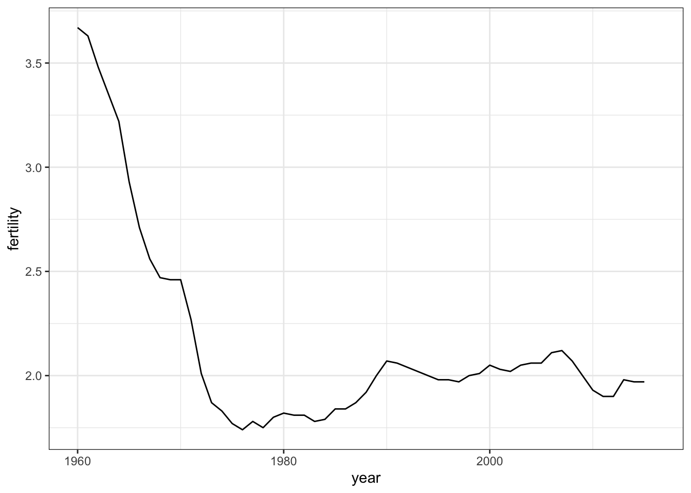
Time series plots have time on the x-axis and a variable of interest on the y-axis.
The
geom_line()geometry connects adjacent data points to form a continuous line. A line plot is appropriate when points are regularly spaced, densely packed and from a single data series.You can plot multiple lines on the same graph. Remember to group or color by a variable so that the lines are plotted independently.
Labeling is usually preferred over legends. However, legends are easier to make and appear by default. Add a label with
geom_text(), specifying the coordinates where the label should appear on the graph.
Code: Single Time Series
Code: Multiple Time Series
# line plot fertility time series for two countries- only one line (incorrect)
countries <- c("South Korea", "Germany")
gapminder %>% filter(country %in% countries) %>%
    ggplot(aes(year, fertility)) +
    geom_line()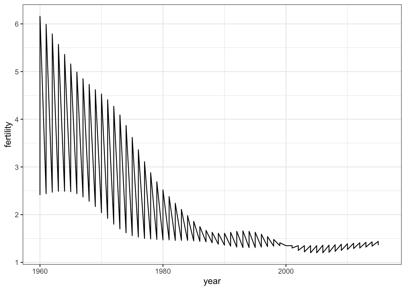
# line plot fertility time series for two countries - one line per country
gapminder %>% filter(country %in% countries) %>%
    ggplot(aes(year, fertility, group = country)) +
    geom_line()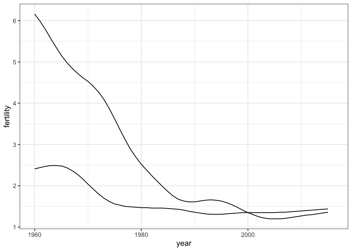
# fertility time series for two countries - lines colored by country
gapminder %>% filter(country %in% countries) %>%
    ggplot(aes(year, fertility, col = country)) +
    geom_line()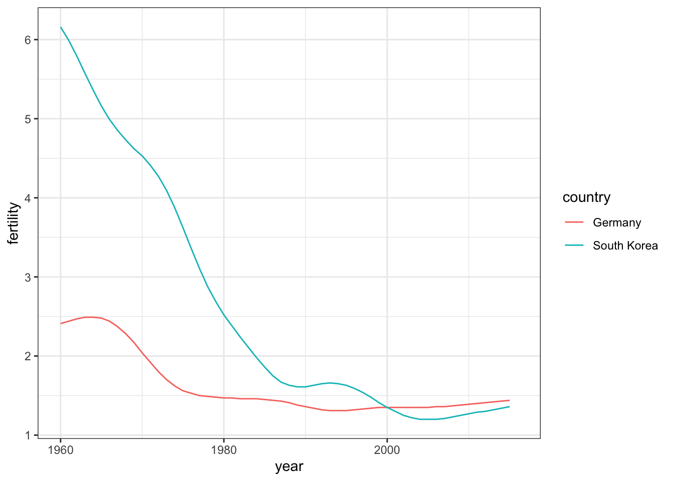
Code: Adding text labels to a plot
labels data frame as the data to ensure where to start label text 
# life expectancy time series - lines colored by country and labeled, no legend
labels <- data.frame(country = countries, x = c(1975, 1965), y = c(60, 72))
gapminder %>% filter(country %in% countries) %>%
    ggplot(aes(year, life_expectancy, col = country)) +
    geom_line() +
    geom_text(data = labels, aes(x, y, label = country), size = 5) +
    theme(legend.position = "none")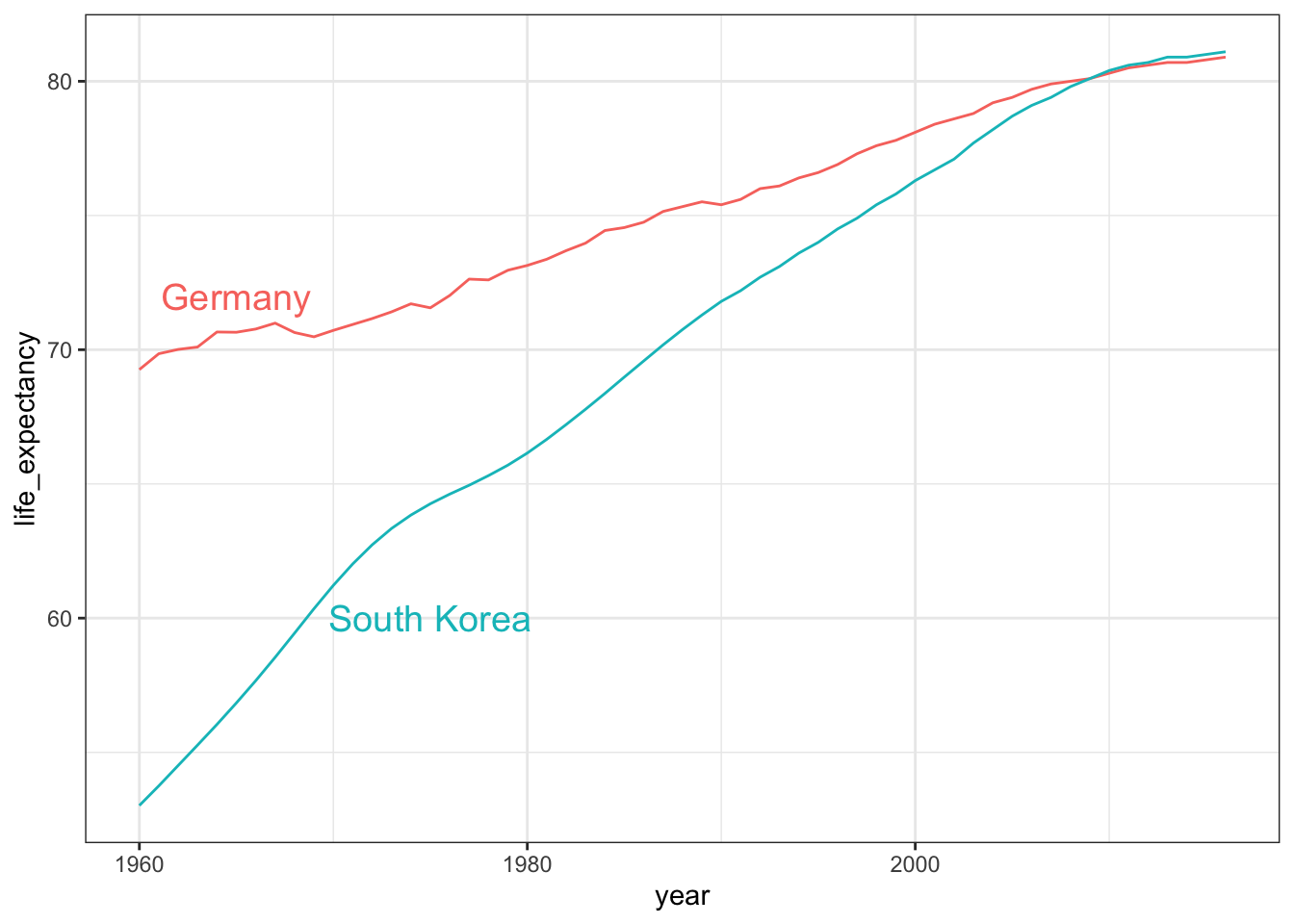
Transformations
Key Points
We use GDP data to compute income in US dollars per day, adjusted for inflation.
Log transformations covert multiplicative changes into additive changes.
common transformations are the log base 2 transformation and the log base 10 transformation. The choice of base depends on the range of the data. The natural log is not recommended for visualization because it is difficult to interpret.
The mode of a distribution is the value with the highest frequency. The mode of a normal distribution is the average. A distribution can have multiple local modes.
There are two ways to use log transformations in plots: transform the data before plotting or transform the axes of the plot. Log scales have the advantage of showing the original values as axis labels, while log transformed values ease interpretation of intermediate values between labels.
Scale the x-axis using
scale_x_continuous()orscale_x_log10()layers in ggplot2. Similar functions exist for the y-axis.In 1970, income distribution is bimodal, consistent with the dichotomous Western versus developing worldview.
Code
# add dollars per day variable
gapminder <- gapminder %>%
  mutate(dollars_per_day = gdp/population/365)

# histogram of dollars per day
past_year <- 1970
gapminder %>%
  filter(year == past_year & !is.na(gdp)) %>%
  ggplot(aes(dollars_per_day)) +
  geom_histogram(binwidth = 1, color = "black")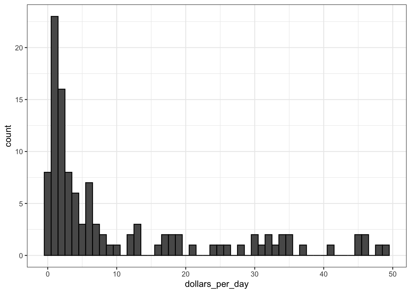
# repeat histogram with log2 scaled data
gapminder %>%
    filter(year == past_year & !is.na(gdp)) %>%
    ggplot(aes(log2(dollars_per_day))) +
    geom_histogram(binwidth = 1, color = "black")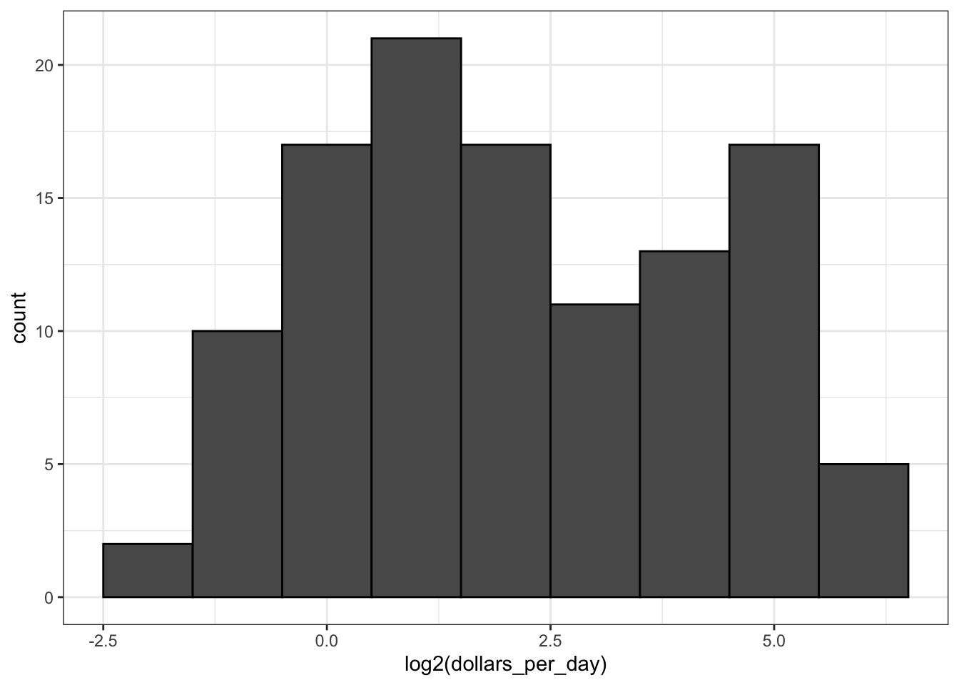
# repeat histogram with log2 scaled x-axis
gapminder %>%
    filter(year == past_year & !is.na(gdp)) %>%
    ggplot(aes(dollars_per_day)) +
    geom_histogram(binwidth = 1, color = "black") +
    scale_x_continuous(trans = "log2")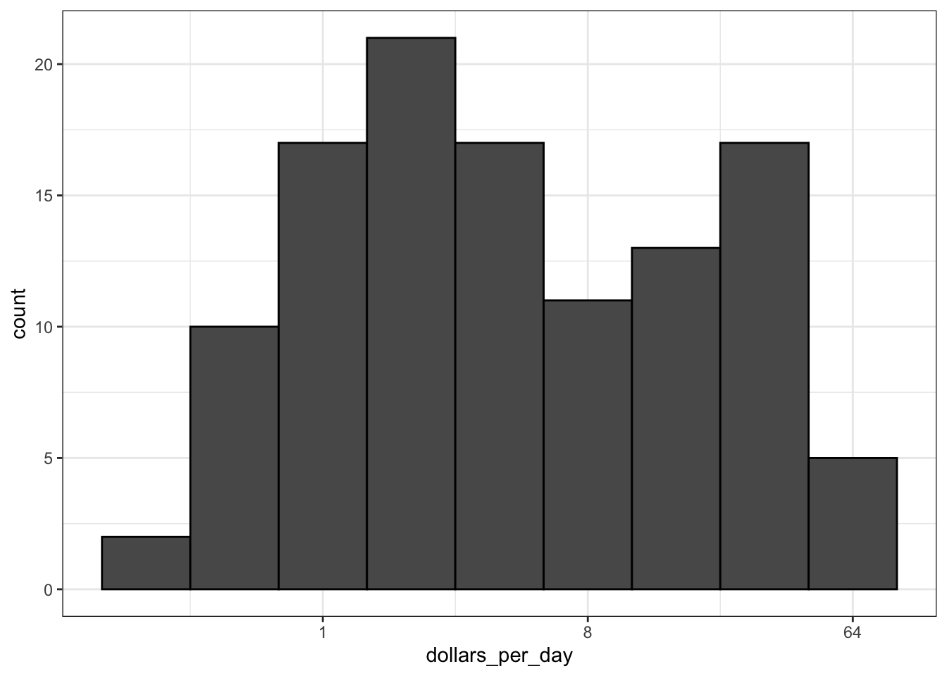
Stratify and Boxplot
Key Points
Make boxplots stratified by a categorical variable using the
geom_boxplot()geometry.Rotate axis labels by changing the theme through
element_text(). You can change the angle and justification of the text labels.Consider ordering your factors by a meaningful value with the
reorderfunction, which changes the order of factor levels based on a related numeric vector. This is a way to ease comparisons.Show the data by adding data points to the boxplot with a
geom_pointlayer. This adds information beyond the five-number summary to your plot, but too many data points it can obfuscate your message.
Code: Boxplot of GDP by region
# add dollars per day variable
gapminder <- gapminder %>%
  mutate(dollars_per_day = gdp/population/365)

# number of regions
length(levels(gapminder$region))
[1] 22# boxplot of GDP by region in 1970
past_year <- 1970
p <- gapminder %>%
filter(year == past_year & !is.na(gdp)) %>%
ggplot(aes(region, dollars_per_day))
p + geom_boxplot()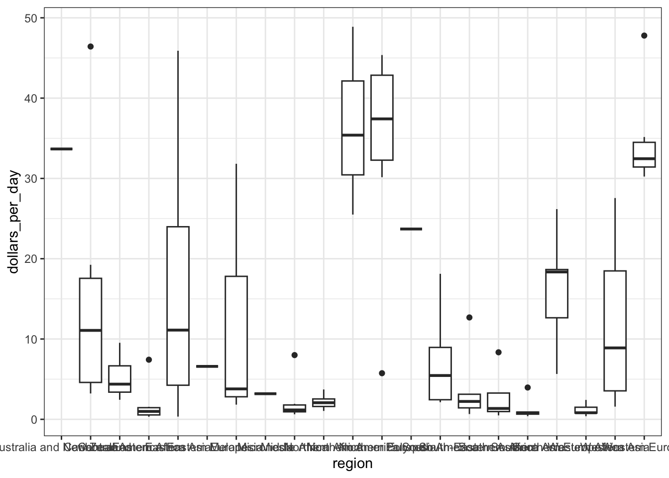
# roation name on x-axis
p + geom_boxplot() +
  theme(axis.text.x = element_text(angle = 90, hjust = 1))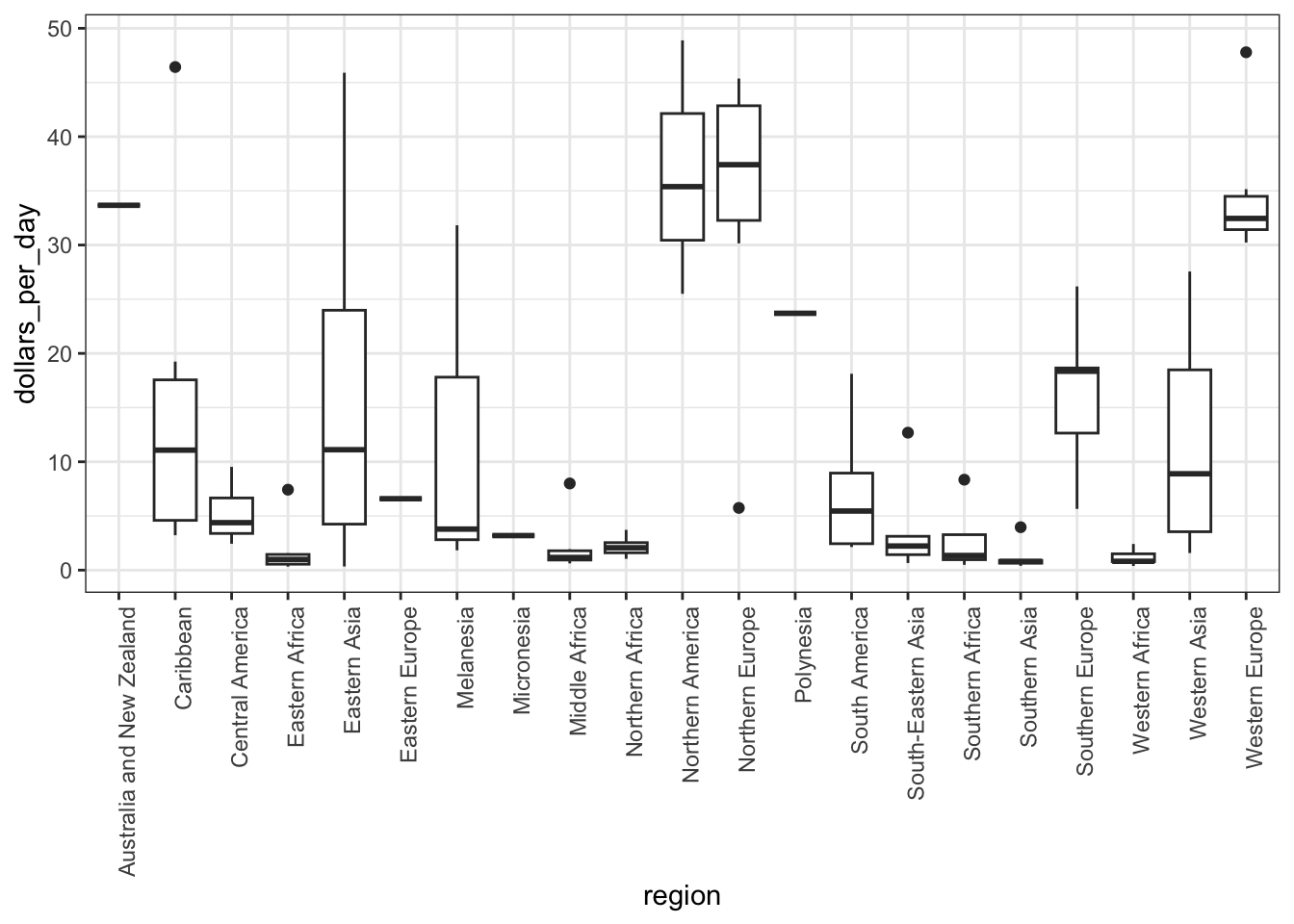
Code: The reorder function
Code: Enhanced boxplot ordered by median income, scaled, and showing data
# reorder by median income and color by continent
p <- gapminder %>%
    filter(year == past_year & !is.na(gdp)) %>%
    mutate(region = reorder(region, dollars_per_day, FUN = median)) %>%  # reorder
    ggplot(aes(region, dollars_per_day, fill = continent)) + # color by continent
    geom_boxplot() +
    theme(axis.text.x = element_text(angle = 90, hjust = 1)) +
    xlab("")
p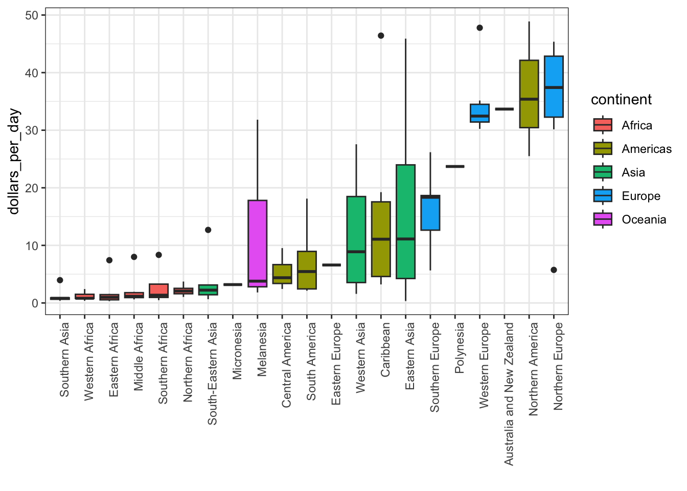
# log2 scale y-axis
p + scale_y_continuous(trans = "log2")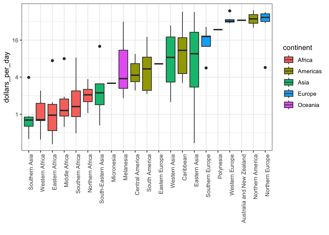
# add data points
p + scale_y_continuous(trans = "log2") + geom_point(show.legend = FALSE)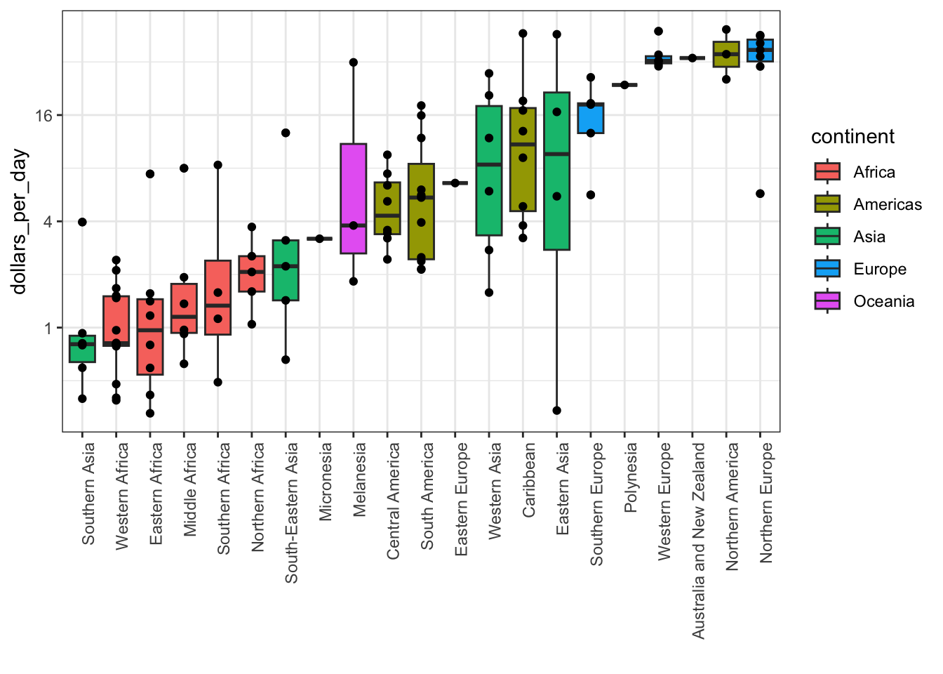
Comparing Distributions
Key Points
- Use
intersectto find the overlap between two vectors. - To make boxplots where grouped variables are adjacaent, color the boxplot by a factor instead of faceting by that factor. This is a way to ease comparisions.
- The data suggest that the income gap between rich and poor countries has narrowed, not expended.
Code: Histogram of income in West versus developing world, 1970 and 2010
# add dollars per day variable and define past year
gapminder <- gapminder %>%
  mutate(dollars_per_day = gdp/population/365)
past_year <- 1970

# define Western countries
west <- c("Western Europe", "Northern Europe", "Southern Europe", "Northern America", "Australia and New Zealand")

# facet by West vs Devloping
gapminder %>%
  filter(year == past_year & !is.na(gdp)) %>%
  mutate(group = ifelse(region %in% west, "West", "Developing")) %>%
  ggplot(aes(dollars_per_day)) +
  geom_histogram(binwidth = 1, color = "black") +
  scale_x_continuous(trans = "log2") +
  facet_grid(. ~group)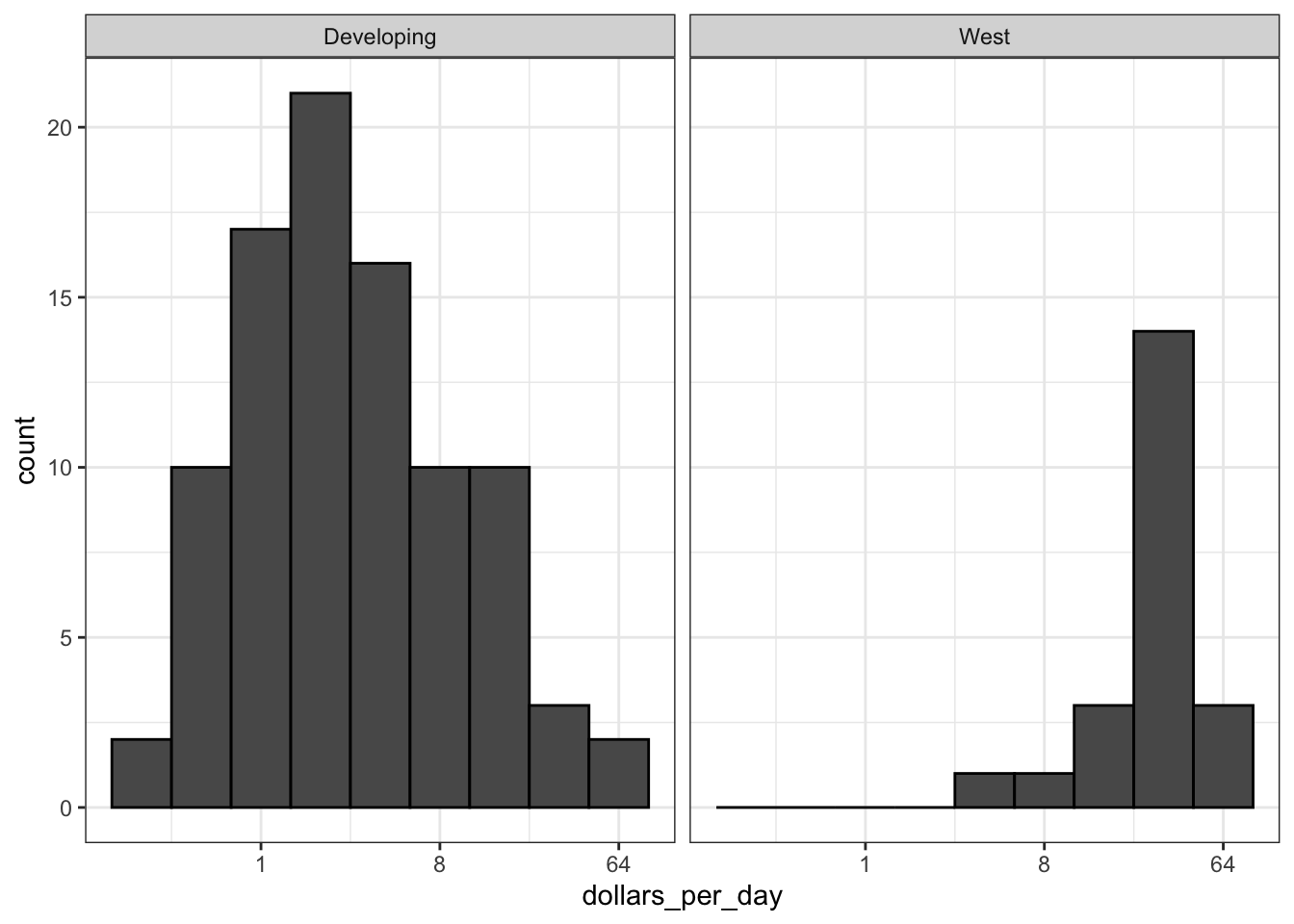
# facet by West/Developing and year
present_year <- 2010
gapminder %>%
    filter(year %in% c(past_year, present_year) & !is.na(gdp)) %>%
    mutate(group = ifelse(region %in% west, "West", "Developing")) %>%
    ggplot(aes(dollars_per_day)) +
    geom_histogram(binwidth = 1, color = "black") +
    scale_x_continuous(trans = "log2") +
    facet_grid(year ~ group)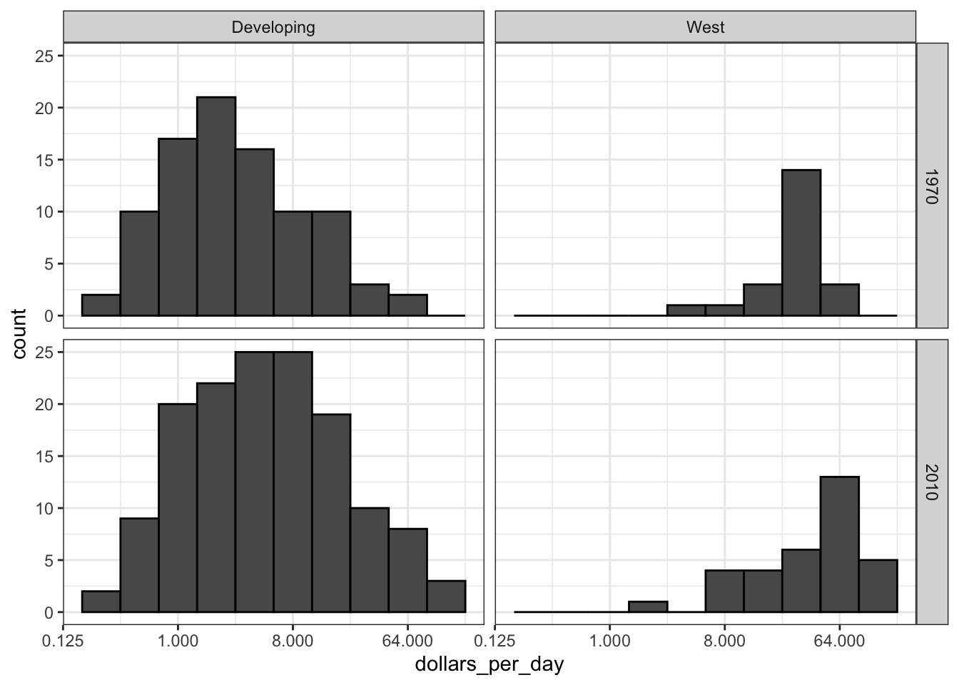
Code: Income distribution of West verseus Developing world, only countries with data
# define countries that have data available in both years
country_list_1 <- gapminder %>%
  filter(year == past_year & !is.na(dollars_per_day)) %>% .$country

country_list_2 <- gapminder %>%
  filter(year == present_year & !is.na(dollars_per_day)) %>% .$country

country_list <- intersect(country_list_1, country_list_2)

# make histogram including only countries with data availabe in both years
gapminder %>%
  filter(year %in% c(past_year, present_year) & country %in% country_list) %>% # keep only selected countries
  mutate(group = ifelse(region %in% west, "West", "Developing")) %>%
  ggplot(aes(dollars_per_day)) +
  geom_histogram(binwidth = 1, color = "black") +
  scale_x_continuous(trans = "log2") +
  facet_grid(year ~ group)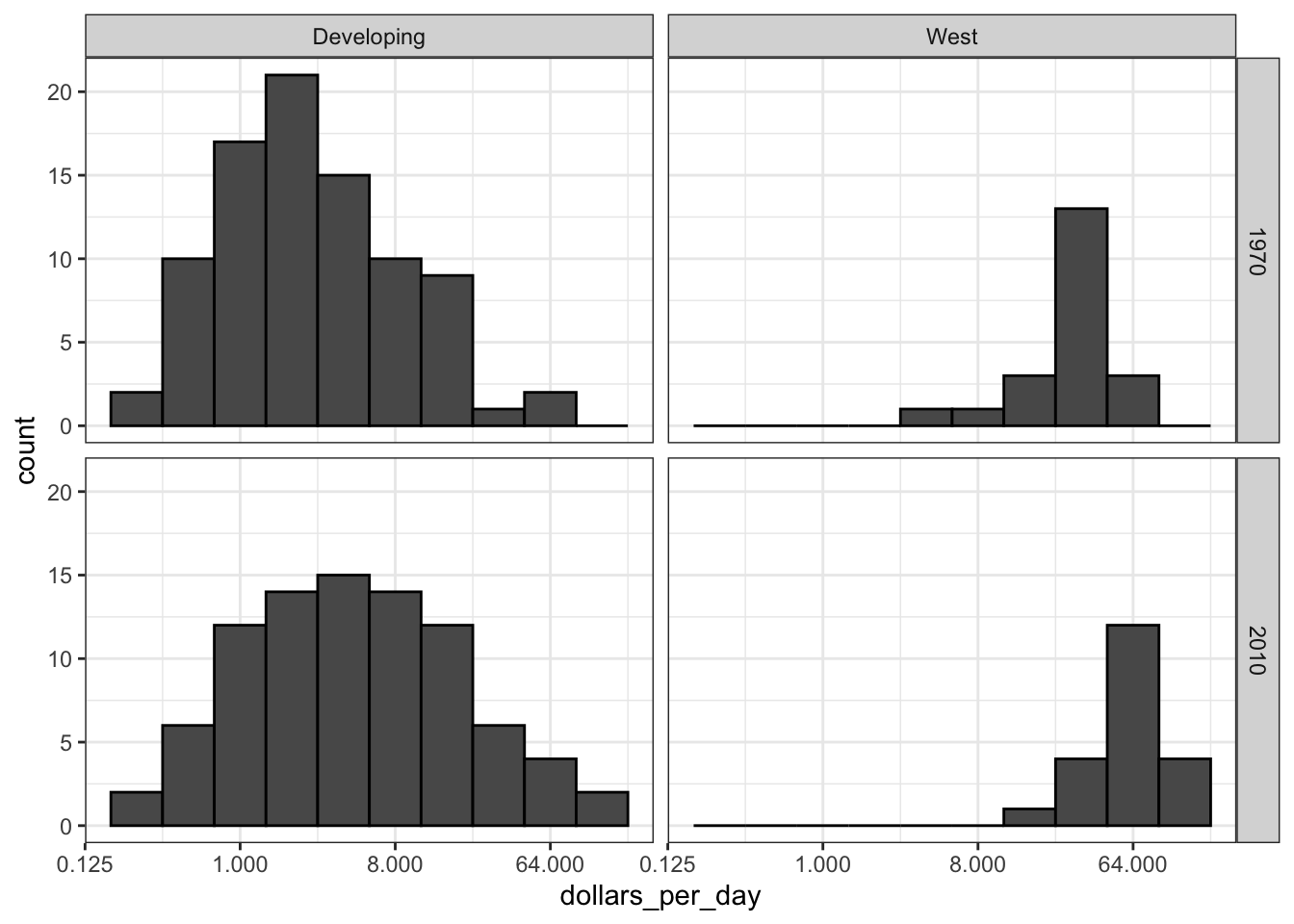
Code: Boxplots of income in West versus Developing world, 1970 and 2010
p <- gapminder %>%
  filter(year %in% c(past_year, present_year) & country %in% country_list) %>%
  mutate(region = reorder(region, dollars_per_day, FUN = median)) %>%
  ggplot() +
  theme(axis.text.x = element_text(angle = 90, hjust = 1)) +
  xlab("") + scale_y_continuous(trans = "log2")

p + geom_boxplot(aes(region, dollars_per_day, fill = continent)) +
  facet_grid(year ~ .)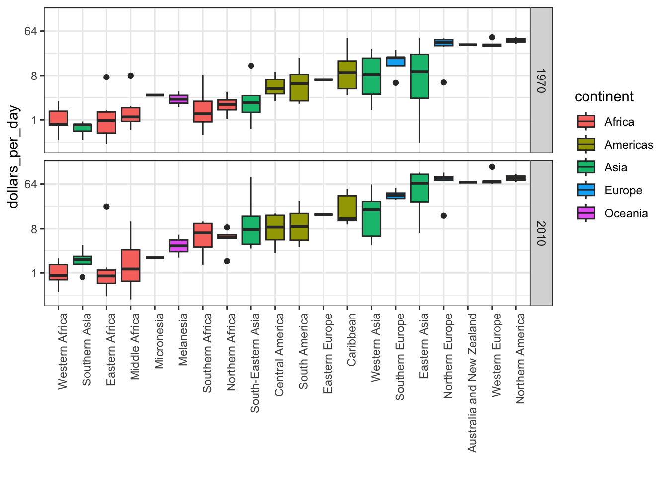
# arrange matching boxplots next to each other, colored by year
p + geom_boxplot(aes(region, dollars_per_day, fill = factor(year)))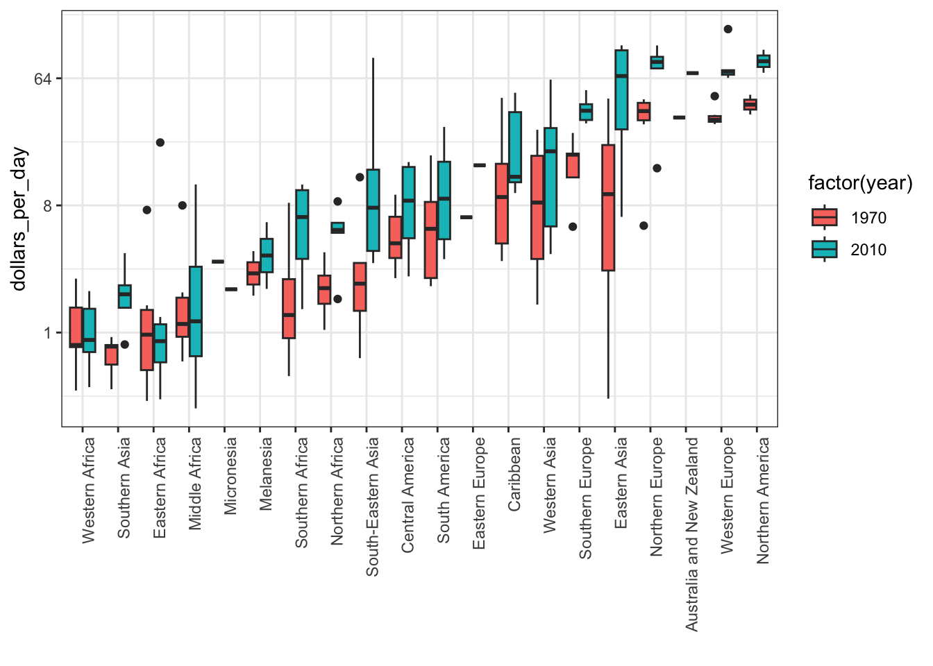
Density Plots
Key Points
Change the y-axis of density plots to variable counts using
..count..as the y argument.The
case_when()function defines a factor whose levels are defined by a variety of logical operations to group data.Plot stacked density plots using
position="stack".Define a weight aesthetic mapping to change the relative weights of density plots-for example, this allow weighting of plots by population rather than number of countries.
Code: Faceted smooth density plots
# see the code below the previous video for variable definitions

# smooth density plots - area under each curve adds to 1
gapminder %>%
  filter(year == past_year & country %in% country_list) %>%
  mutate(group = ifelse(region %in% west, "West", "Developing")) %>% group_by(group) %>%
summarize(n = n()) %>% knitr::kable()| group | n |
|---|---|
| Developing | 87 |
| West | 21 |
# smooth density plots - variable counts on y-axis
p <- gapminder %>%
  filter(year == past_year & country %in% country_list) %>%
  mutate(group = ifelse(region %in% west, "West", "Developing")) %>%
  ggplot(aes(dollars_per_day, y = ..count.., fill = group)) +
  scale_x_continuous(trans = "log2")
p + geom_density(alpha = 0.2, bw = 0.75) + facet_grid(year ~ .)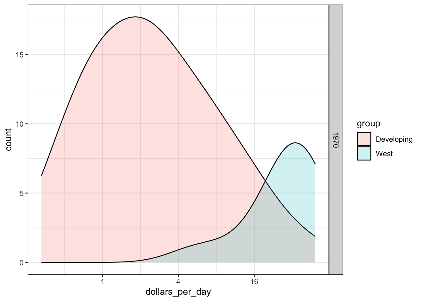
Code: Add new region group with case_when
# add group as a factor, grouping regions
gapminder <- gapminder %>%
  mutate(group = case_when(
    .$region %in% west ~ "West",
    .$region %in% c("Eastern Asia", "South-Eastern Asia") ~ "East Asia",
    .$region %in% c("Caribbean", "Central America", "South America") ~ "Latin America",
    .$continent == "Africa" & .$region != "Northern Africa" ~ "Sub-Saharan Africa", TRUE ~ "Others"))

# reorder factor levels
gapminder <- gapminder %>%
  mutate(group = factor(group, levels = c("Others", "Latin America", "East Asia", "Sub-Saharan Africa", "West")))
Code: Stacked density plot
# note you must redefine p with the new gapminder object first
p <- gapminder %>%
  filter(year %in% c(past_year, present_year) & country %in% country_list) %>%
  ggplot(aes(dollars_per_day, fill = group)) +
  scale_x_continuous(trans = "log2")

# stacked density plot
p + geom_density(alpha = 0.2, bw = 0.75, position = "stack") +
  facet_grid(year ~ .)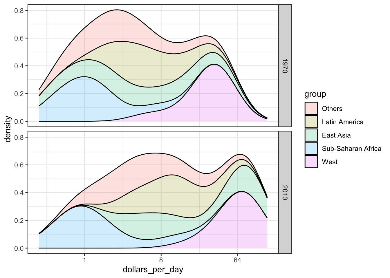
Code: Weighted stacked density plot
gapminder %>%
  filter(year %in% c(past_year, present_year) & country %in% country_list) %>%
  group_by(year) %>%
  mutate(weight = population/sum(population*2)) %>%
  ungroup() %>%
  ggplot(aes(dollars_per_day, fill = group, weight = weight)) +
  scale_x_continuous(trans = "log2") +
  geom_density(alpha = 0.2, bw = 0.75, position = "stack") + facet_grid(year ~ .)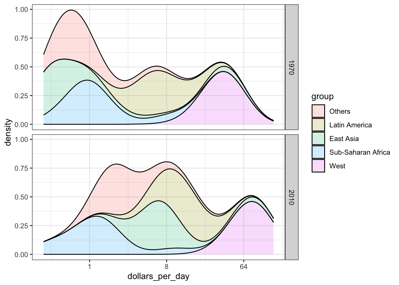
Ecological Fallacy
Textbook link
Key Points
The breaks argument allows us to set the location of the axis labels and tick marks.
the logistic or logit transformation is defined as \(f(p)=log\frac{1}{1-p}\), or the log of odds. This scale is useful for highlighting difference near 0 or near 1 and converts fold changes into constant increase.
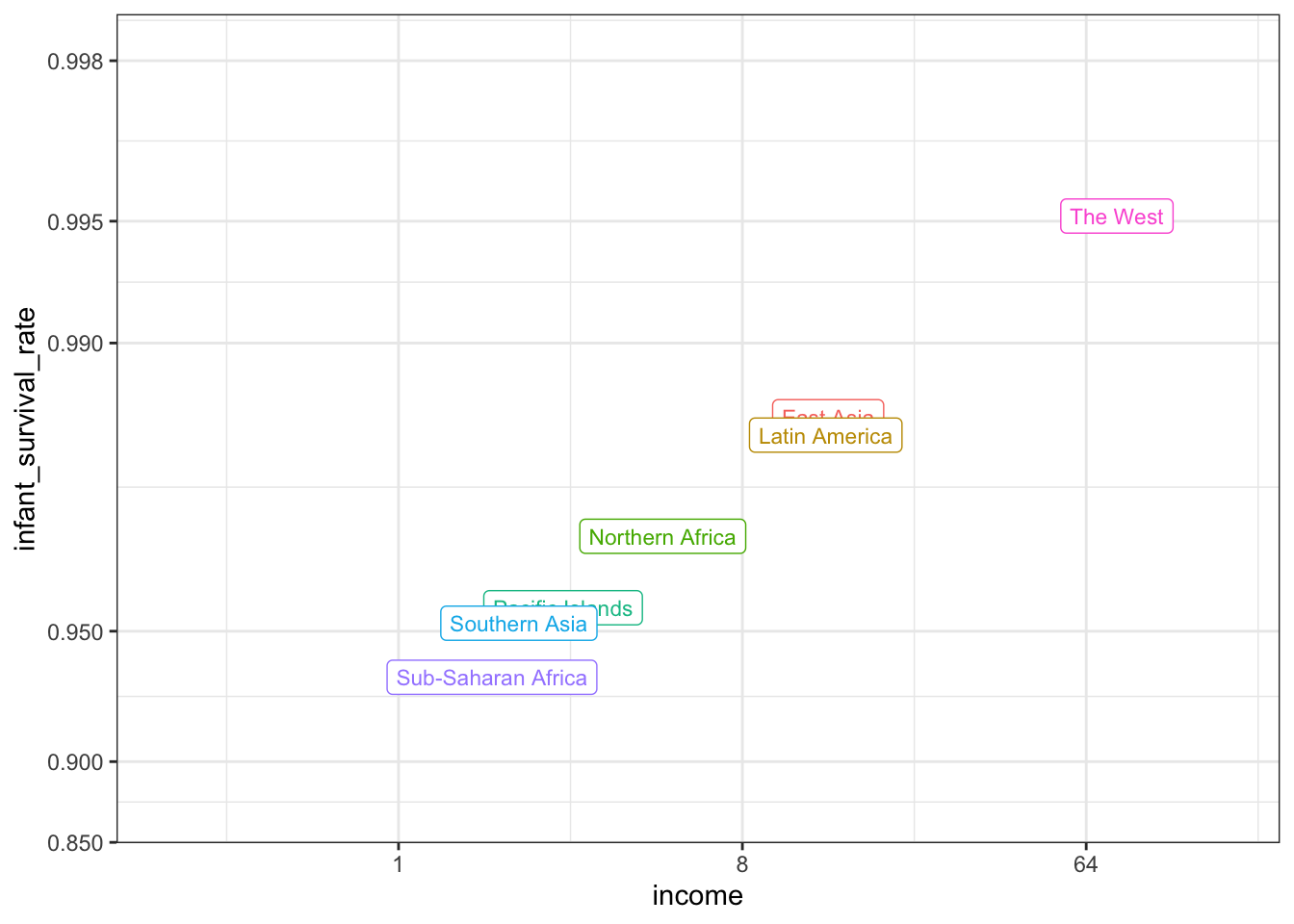
The ecological fallacy is assuming that conclusion made from the average of a group apply to all members of that group.
Code
# add additional cases
gapminder <- gapminder %>%
    mutate(group = case_when(
        .$region %in% west ~ "The West",
        .$region %in% "Northern Africa" ~ "Northern Africa",
        .$region %in% c("Eastern Asia", "South-Eastern Asia") ~ "East Asia",
        .$region == "Southern Asia" ~ "Southern Asia",
        .$region %in% c("Central America", "South America", "Caribbean") ~ "Latin America",
        .$continent == "Africa" & .$region != "Northern Africa" ~ "Sub-Saharan Africa",
        .$region %in% c("Melanesia", "Micronesia", "Polynesia") ~ "Pacific Islands"))

# define a data frame with group average income and average infant survival rate
surv_income <- gapminder %>%
    filter(year %in% present_year & !is.na(gdp) & !is.na(infant_mortality) & !is.na(group)) %>%
    group_by(group) %>%
    summarize(income = sum(gdp)/sum(population)/365,
                        infant_survival_rate = 1 - sum(infant_mortality/1000*population)/sum(population))
surv_income %>% arrange(income)
# A tibble: 7 × 3
group income infant_survival_rate
<chr> <dbl> <dbl>
1 Sub-Saharan Africa 1.76 0.936
2 Southern Asia 2.07 0.952
3 Pacific Islands 2.70 0.956
4 Northern Africa 4.94 0.970
5 Latin America 13.2 0.983
6 East Asia 13.4 0.985
7 The West 77.1 0.995# plot infant survival versus income, with transformed axes
surv_income %>% ggplot(aes(income, infant_survival_rate, label = group, color = group)) +
scale_x_continuous(trans = "log2", limit = c(0.25, 150)) +
scale_y_continuous(trans = "logit", limit = c(0.875, .9981),
breaks = c(.85, .90, .95, .99, .995, .998)) +
geom_label(size = 3, show.legend = FALSE)