Introduction to ggplot2
Overview
After completing ggplot2, you will:
be able to use ggplot2 to create data visualizations in R.
be able to explain what the data component of a graph is.
be able to identify the geometry component of a graph and know when to use which type of geometry. be able to explain what the aesthetic mapping component of a graph is.
be able to understand the scale component of a graph and select an appropriate scale component to use.
ggplot
ggplot2
key Points:
Throughout the series, we will create plots with the ggplot2 package. ggplot2 is part of the tidyverse suite of package, which you can load with
library(tidyverse).Note that you can also load ggplot2 alone using the command
library(ggplot2), instead of loading the entire tidyverse.ggplot2 uses a grammar of graphics to break plots into building blocks that have intuitive syntax, making it easy to create relatively complex and aesthetically pleasing plots with relatively simple and readable code.
ggplot2 is designed to work excusively with tidy data (rows are observations and columns are variables).
Graph Components
Key Points:
- Plots in ggplot2 consist of 3 main components:
- Data: The dataset being summarized
- Geometry: The type of plot(scatterplot, boxplot, barplot, histogram, qqplot, smooth desity, etc.)
- Aesthetic mapping: Variable mapped to visual cues, such as x-axis and y-axis values and color.
Code:
Creating a New Plot
Key Points:
-
You can associated a dataset
xwith a ggplot object with any of the 3 commands:ggplot(data = x)ggplot(x)x %>% ggplot()
You can assign a ggplot object to a variable. If the object is not assigned to a variable, it will automatically be displayed.
You can display a ggplot object assigned to a variable by printing that variable.
Code:
── Attaching core tidyverse packages ──────────────────────── tidyverse 2.0.0 ──
✔ dplyr 1.1.2 ✔ readr 2.1.4
✔ forcats 1.0.0 ✔ stringr 1.5.0
✔ ggplot2 3.4.2 ✔ tibble 3.2.1
✔ lubridate 1.9.2 ✔ tidyr 1.3.0
✔ purrr 1.0.1
── Conflicts ────────────────────────────────────────── tidyverse_conflicts() ──
✖ dplyr::filter() masks stats::filter()
✖ dplyr::lag() masks stats::lag()
ℹ Use the conflicted package (<http://conflicted.r-lib.org/>) to force all conflicts to become errors

[1] "gg" "ggplot"print(p) # this is equivalent to simply typing p
p 
Layers
Key Points:
In ggplot2, graphs are created by adding layers to the ggplot object: DATA %>% ggplot() + LAYER_1 + LAYER_2 + … + LAYER_N
The geometry layer defines that plot type and takes the format
geom_xwherexis the plot type.Aesthetic mappings describe how properties of the data connect with features of the graph (axis position, color, size, etc.) define aesthetic mapping with
aes()function.aes()uses variable names from the object component (for example,totalrather thanmurders$total).geom_point()creates a scatterplot and requiresxandyaesthetic mappings.geom_text()andgeom_labeladd text to a scatterplot and requirex,y, andlabelaesthetic mappings.To determine which aesthetic mappings are required for a geometry, read the help file for that geometry.
You can add layers with different aesthetic mappings to the same graph.
Code: Adding layers to a plot
# add points layer to predefined ggplot object
p <- ggplot(data = murders)
p + geom_point(aes(population/10^6, total))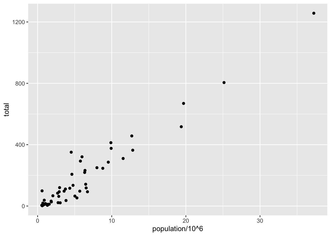
# add text layer to scatterplot
p + geom_point(aes(population/10^6, total)) +
geom_text(aes(population/10^6, total, label = abb))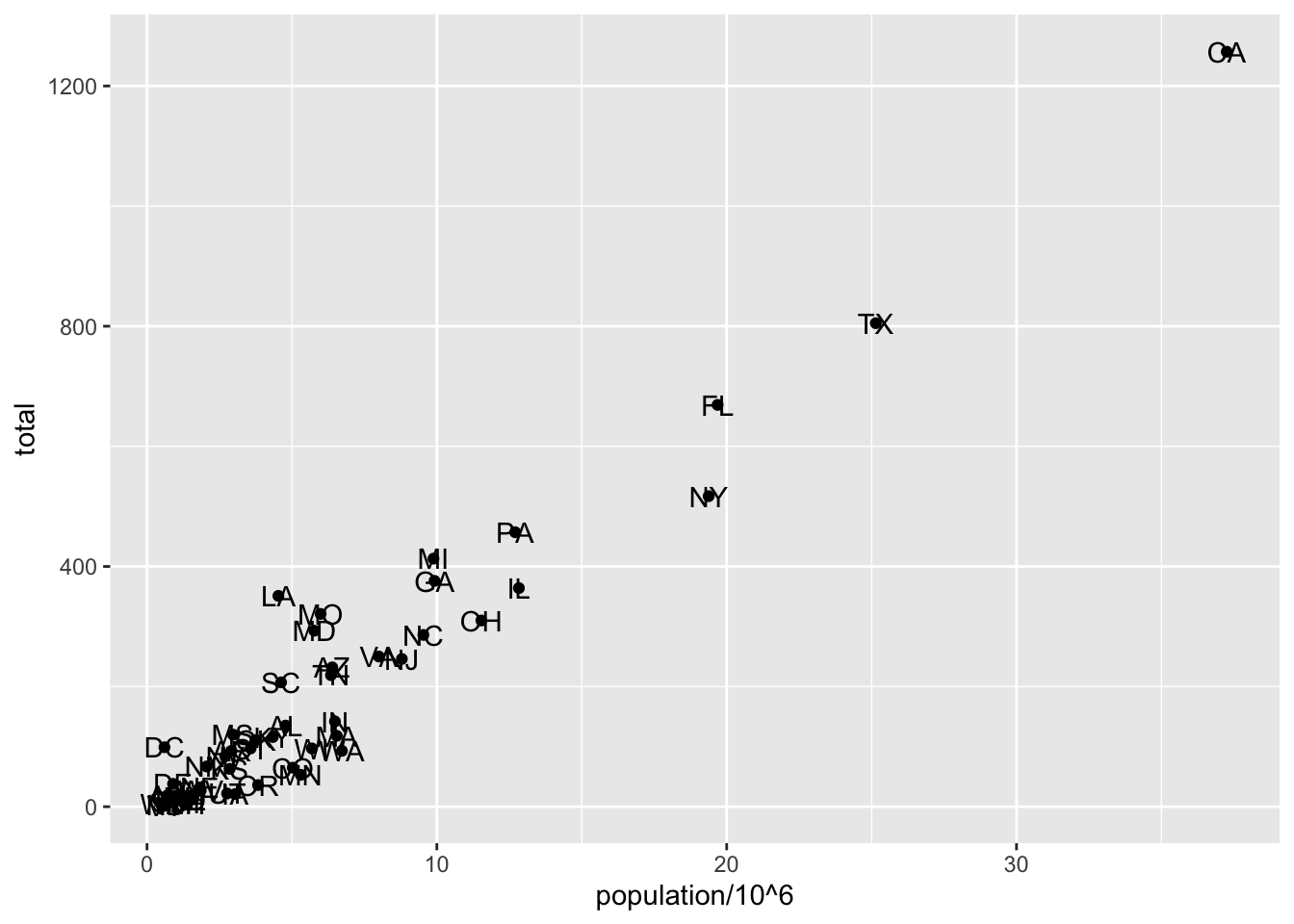
Code: Example of aes behavior
Thinkering
Key Points:
You can modify arguments to geometry functions others than
aes()and the data.These arguments are not aesthetic mappings: the affect all data points the same way.
Global aesthetic mappings apply to all geometries and can be defined when you initially call
ggplot(). All the geometries added as layers will default to this mapping. Local aesthetic mapping add additional information or override the default mappings.
position_nudge(x = 0, y = 0) is generally useful for adjusting the position of items on discrete scales by a small amount. Nudging is built in to geom_text() because it’s so useful for moving labels a small distance from what they’re labeling.
Code:
# change the size of the points
p + geom_point(aes(population/10^6, total), size = 3) +
geom_text(aes(population/10^6, total, label = abb))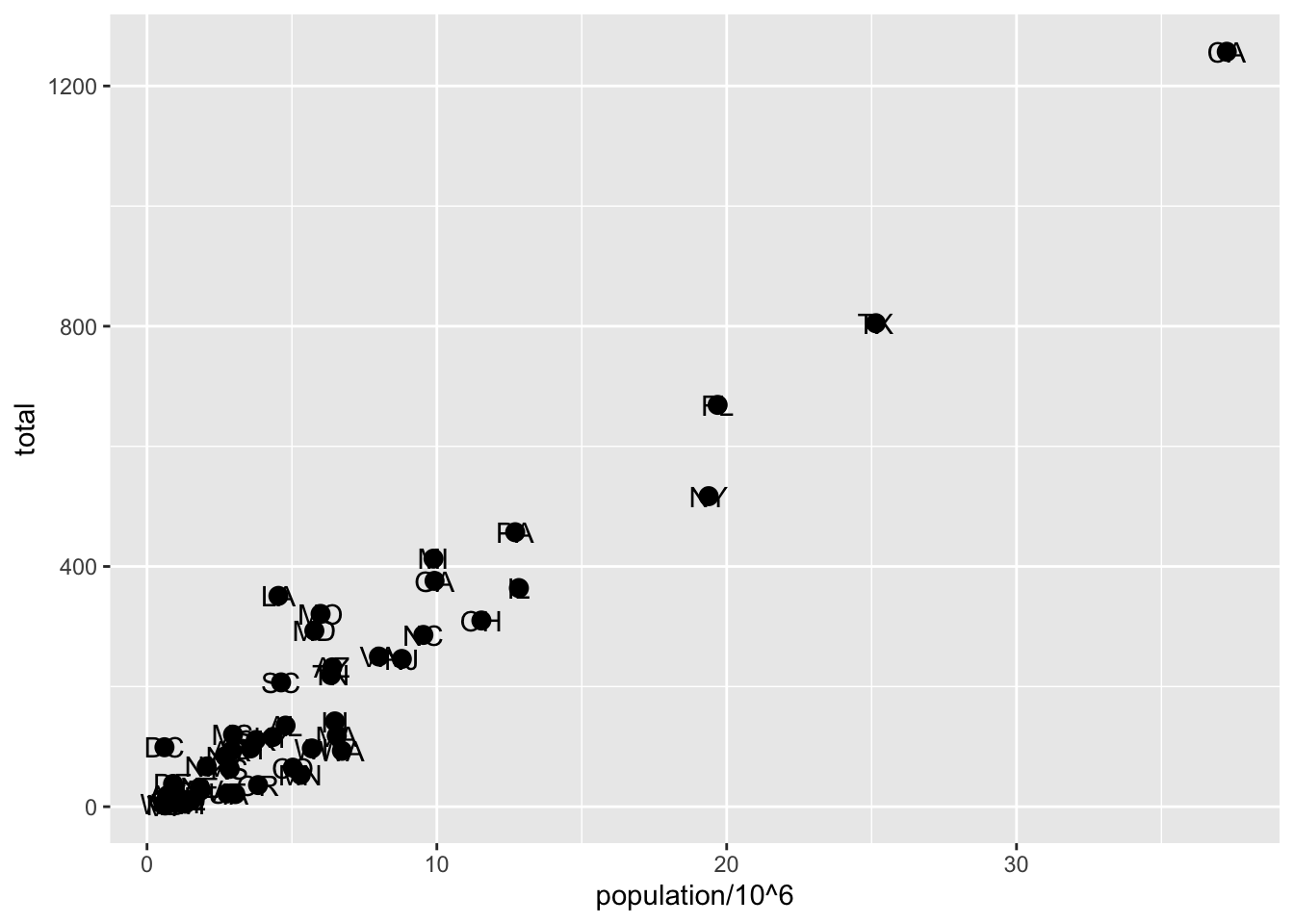
# move text labels slightly to the right
p + geom_point(aes(population/10^6, total), size = 3) +
geom_text(aes(population/10^6, total, label = abb), nudge_x = 1)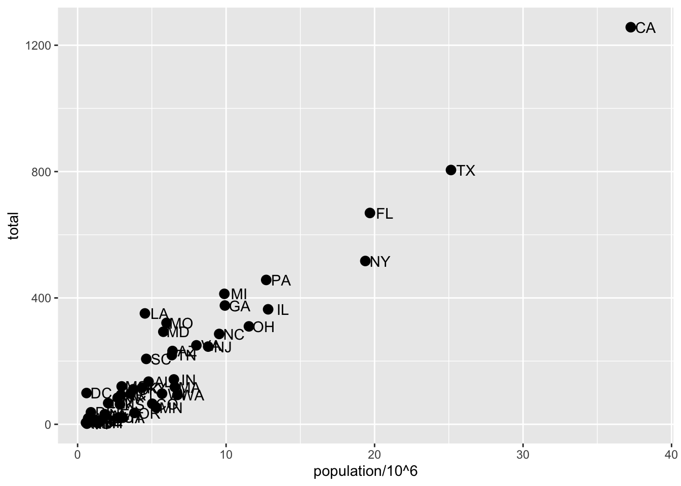
# simplify code by adding global aesthetic
p <- murders %>% ggplot(aes(population/10^6, total, label = abb))
p + geom_point(size = 3) +
geom_text(nudge_x = 1.5)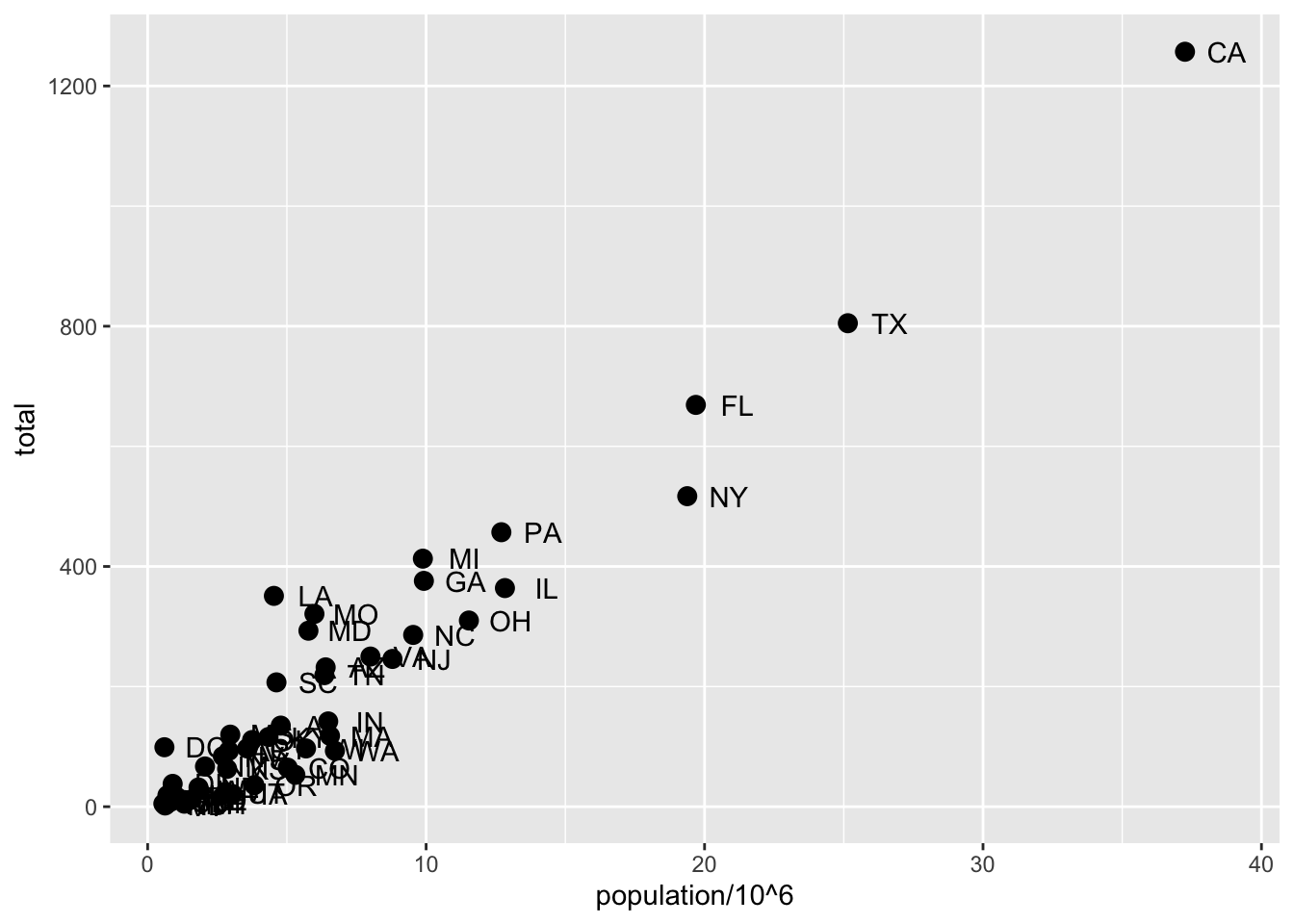
# local aesthetics override global aesthetics
p + geom_point(size = 3) +
geom_text(aes(x = 10, y = 800, label = "Hello there!"))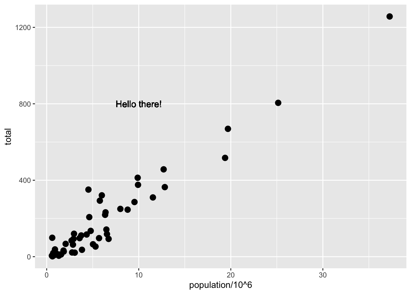
Scales, Labels, and Colors
Textbook links:
Key Points:
Convert the x-axis to log scale with
scale_x_continuous(trans = "log10")orscale_x_log10(). Similar function exist for the y-axis.Add axis title with
xlab()andylab()function. Add a plot title with theggtitle()function.Add a color mapping that colors points by a varaibale by defining
colargument withinaes(). To color all pints the same way, definecoloutside ofaes().Add a line with the
geom_abline()geometry.geom_abline()takes argumentsslop(default = 1) andintercept(default = 0). Change the color withcolorcolorand line type withlty.Placing the line layer after the point layer will overlay the the line on top of the points. To overlay points on the line, place the line layer before the point layer.
There are many additional ways to tweak your graph that can be found in the ggplot2 documentation, cheat sheet or on the internet. For example, you can change the legend title with
scale_color_discrete.
Code: Log-scale the x-axis and y-axis
# define p
library(tidyverse)
library(dslabs)
data(murders)
p <- murders %>% ggplot(aes(population/10^6, total, label = abb))
# log base 10 scale the x-axis and y-axis
p + geom_point(size = 3) +
geom_text(nudge_x = 0.05) +
scale_x_continuous(trans = "log10") +
scale_y_continuous(trans = "log10")# efficient log scaling of the axes
p + geom_point(size = 3) +
geom_text(nudge_x = 0.05) +
scale_x_log10() +
scale_y_log10()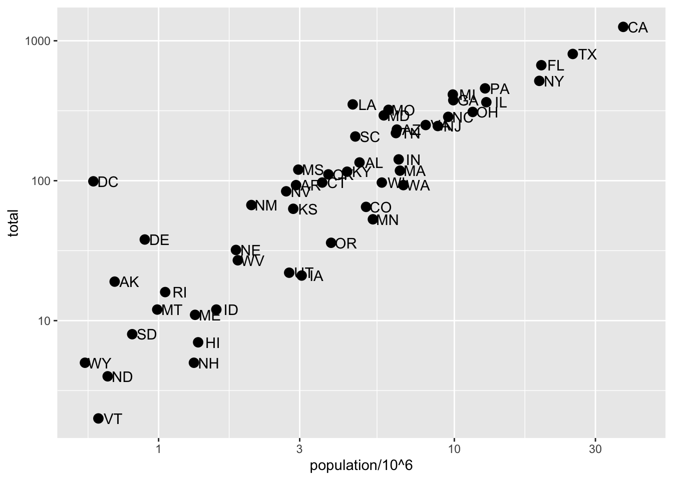
Code: Add labels and title
p + geom_point(size = 3) +
    geom_text(nudge_x = 0.05) +
    scale_x_log10() +
    scale_y_log10() +
    xlab("Population in million(log scale)") +
    ylab("Total number of murders(log scale)") +
    ggtitle("US Gun Murders in 2010")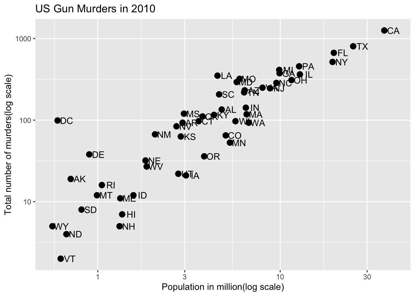
Code: Change color of the points
# redefine p to be everything except the points layer
p <- murders %>%
     ggplot(aes(population/10^6, total, label = abb)) +
     geom_text(nudge_x = 0.075) +
     scale_x_log10() +
     scale_y_log10() +
     xlab("Population in million(log scale)") +
     ylab("Total number of murders(log scale)") +
     ggtitle("US Gun Murders in 2010")
# make all points blue
p + geom_point(size = 3, color = "blue")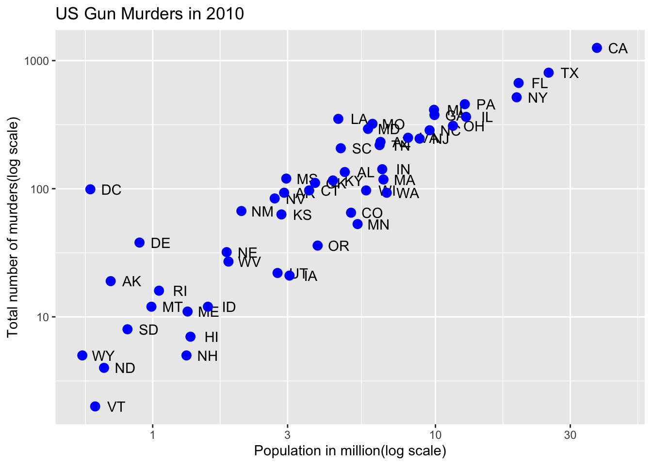
# color points by region
p + geom_point(aes(col = region), size = 3)
Code: Add a line with average murder rate
r <- murders %>%
     summarize(rate = sum(total) / sum(population) * 10^6) %>%      pull(rate)

p <- p + geom_point(aes(col = region), size = 3) +
         geom_abline(intercept = log10(r)) # slop is default of 1

# change line to dashed and dark grey, line under points
p + geom_abline(intercept = log(r), lty = 2, color = "darkgrey") +
    geom_point(aes(col = region), size = 3)
The different line types available in R are shown in the figure hereafter. The argument lty can be used to specify the line type. To change line width, the argument lwd can be used.
Code: Change legend title
# capitalize legend title
p <- p + scale_color_discrete(name = "Region")
p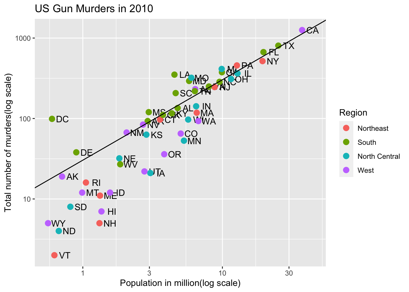
Add-on packages
Textbook links:
Key Points
The style of a ggplot graph can be changed using the
theme()function.The
ggthemespackage adds additional themes.The
ggrepelpackage includes a geometry that repels text labels, ensuring they do not overlap with each other:geom_text_repel().
Code: Adding themes
# theme used for graphs in the textbook and course
library(dslabs)
ds_theme_set()p + theme_economist() # style of the Economist magazine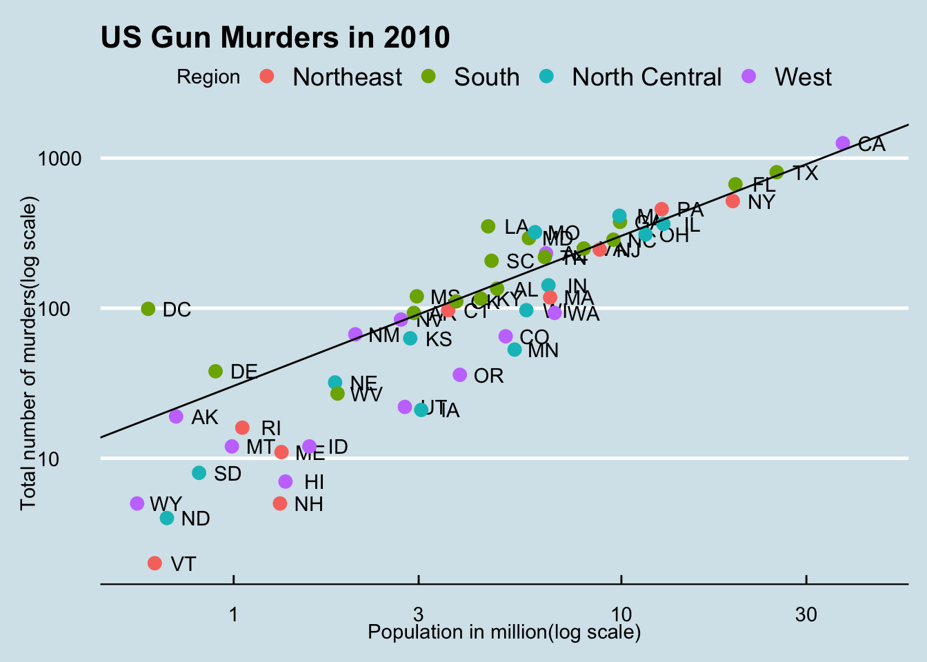
p + theme_fivethirtyeight() # style of the FiveThirtyEight website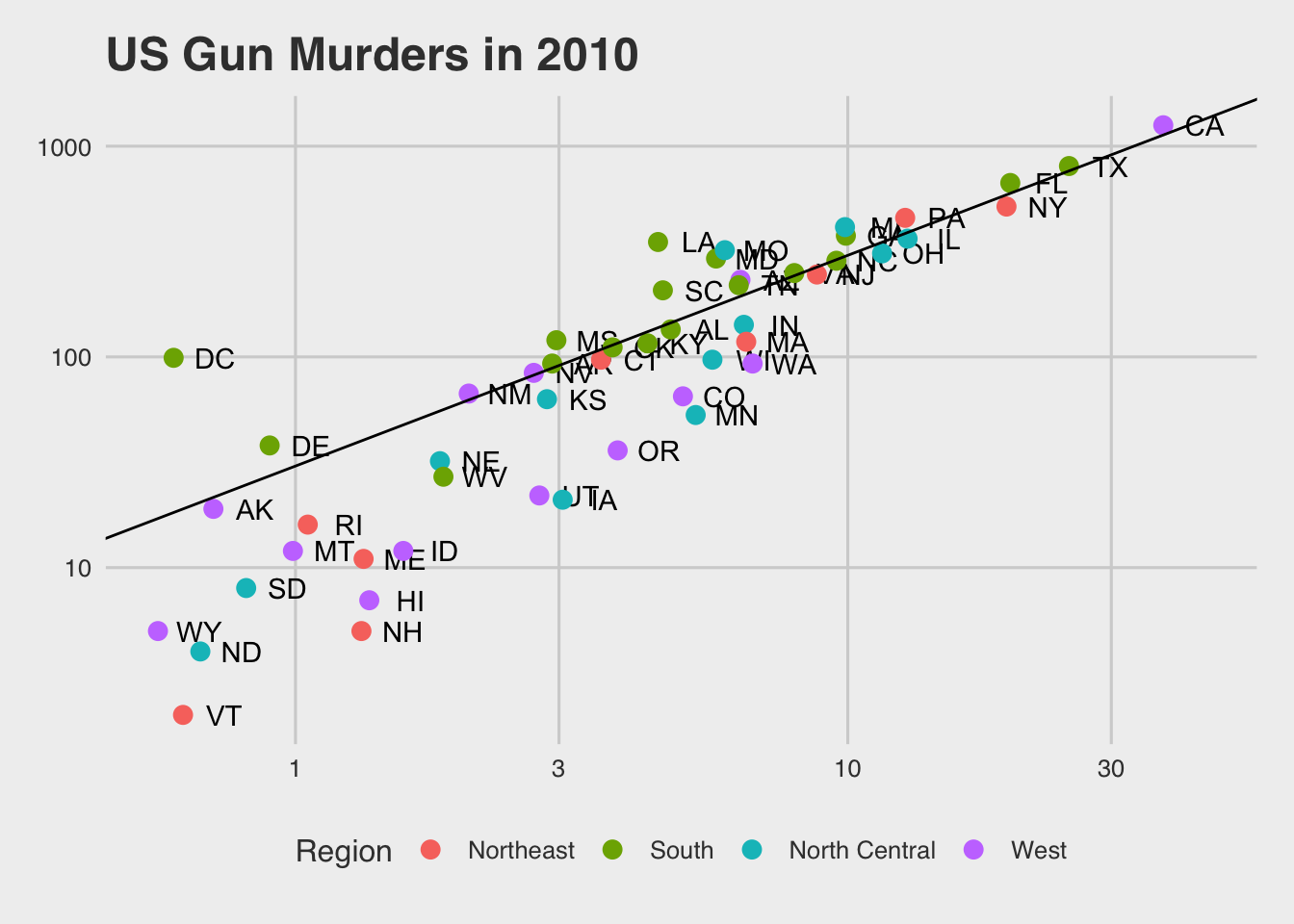
Code: Putting it all together to assemble the plot
# define the intercept
r <- murders %>%
    summarize(rate = sum(total) / sum(population) * 10^6) %>%
    .$rate

# make the plot, combining all elements
murders %>%
    ggplot(aes(population/10^6, total, label = abb)) +
    geom_abline(intercept = log10(r), lty = 2, color = "darkgrey") +
    geom_point(aes(col = region), size = 3) +
    geom_text_repel() +
    scale_x_log10() +
    scale_y_log10() +
    xlab("Population in millions (log scale)") +
    ylab("Total number of murders (log scale)") +
    ggtitle("US Gun Murders in 2010") +
    scale_color_discrete(name = "Region") +
    theme_economist()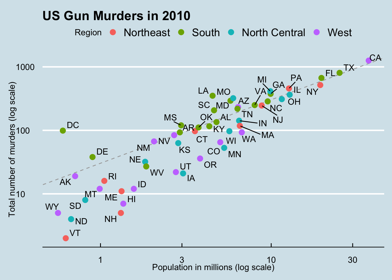
Other Examples
Textbook links:
Key points
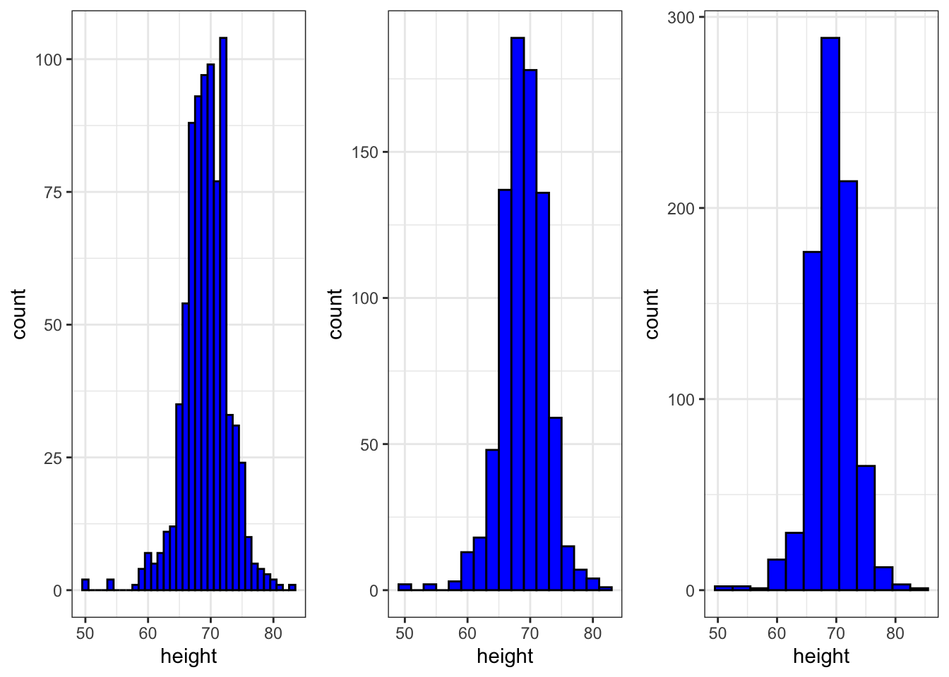
geom_histogram()creates a histogram. Use the binwidth argument to change the width of bins, the fill argument to change the bar fill color, and the col argument to change bar outline color.geom_density()creates smooth density plots. Change the fill color of the plot with the fill argument.geom_qq()creates a quantile-quantile plot. This geometry requires the sample argument. By default, the data are compared to a standard normal distribution with a mean of 0 and standard deviation of 1. This can be changed with the dparams argument, or the sample data can be scaled.Plots can be arranged adjacent to each other using the
grid.arrange()function from the gridExtra package. First, create the plots and save them to objects (p1, p2, …). Then pass the plot objects togrid.arrange().
Code: Histograms in ggplot2
# basic histograms
p + geom_histogram() + ggtitle("binwidth is default")
`stat_bin()` using `bins = 30`. Pick better value with `binwidth`.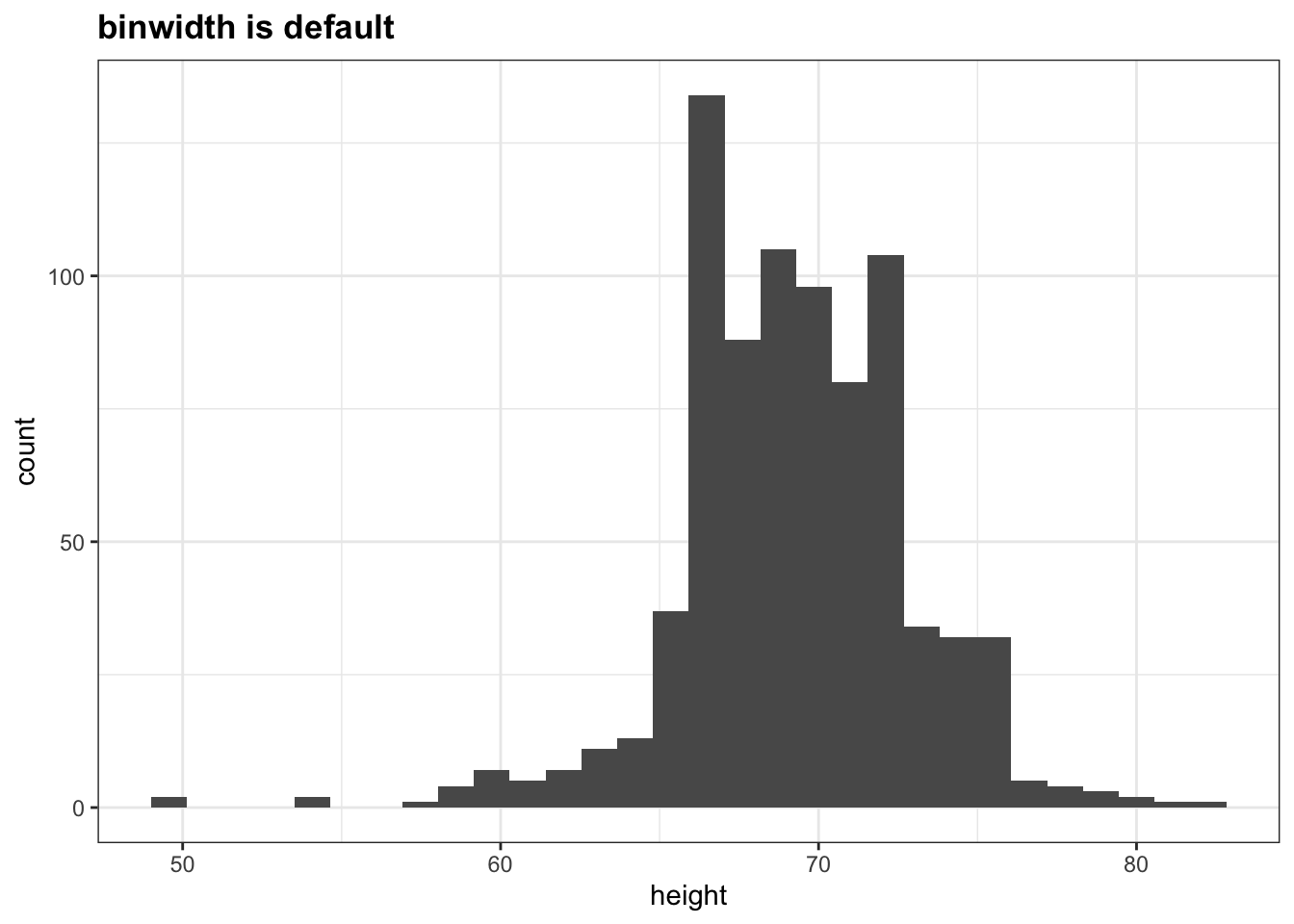
p + geom_histogram(binwidth = 1) + ggtitle("binwidth is 1")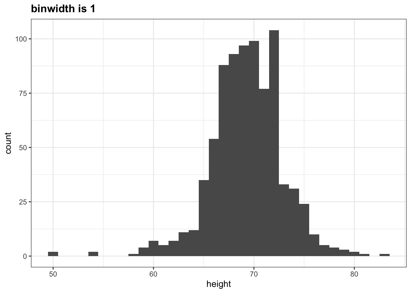
# histogram with blue fill, black outline, labels and title
p + geom_histogram(binwidth = 1, fill ="blue", col = "black") +
  xlab("Male heights in inches") +
  ggtitle("histogram")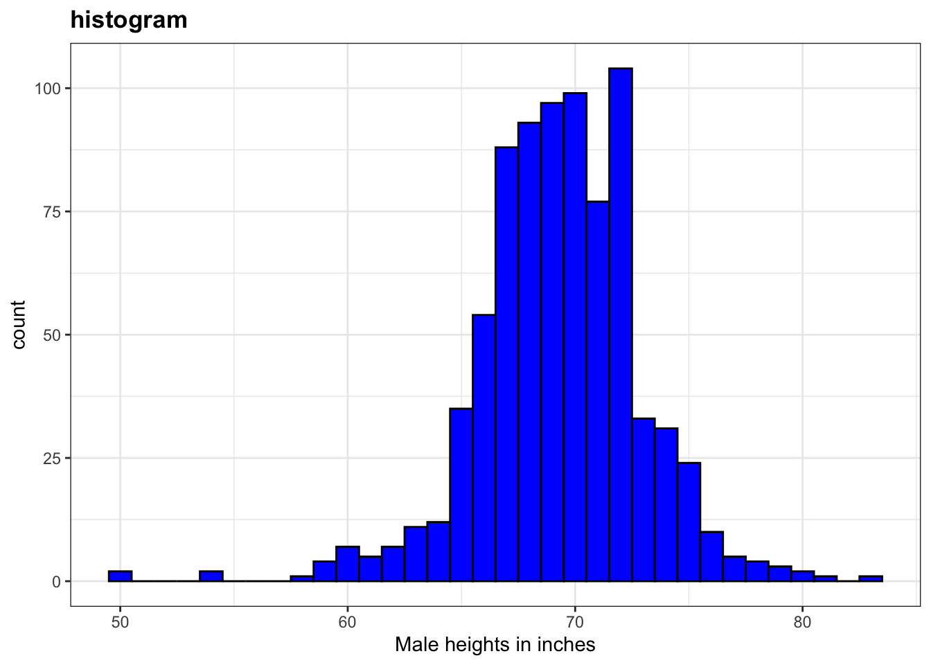
Code: Smooth density plots in ggplot2
p + geom_density()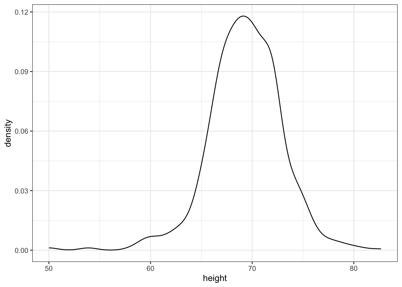
p + geom_density(fill = "blue", col = "red") +
  xlab("Male heights in inches") +
  ylab("proportion of Male heights") +
  ggtitle("Male heights distribution")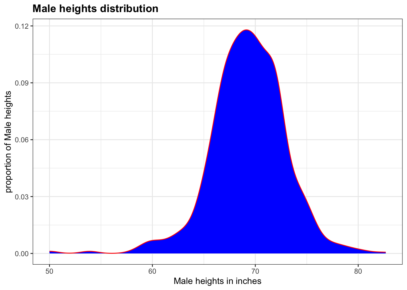
Code: Quantile-quantile plots in ggplot2
# basic QQ-plot
p <- heights %>% filter(sex == "Male") %>%
  ggplot(aes(sample = height))
p + geom_qq()
# QQ-plot against a normal distribution with same mean/sd as data
params <- heights %>%
  filter(sex == "Male") %>%
  summarize(mean = mean(height), sd = sd(height))
p + geom_qq(dparams = params) +
  geom_abline()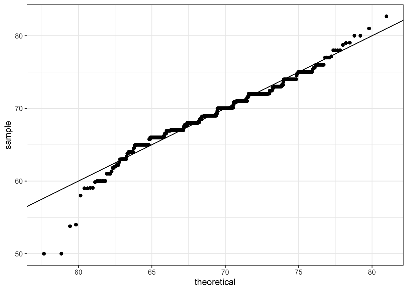
# QQ-plot of scaled data against the standard normal distribution
heights %>%
  ggplot(aes(sample = scale(height))) +
  geom_qq() +
  geom_abline()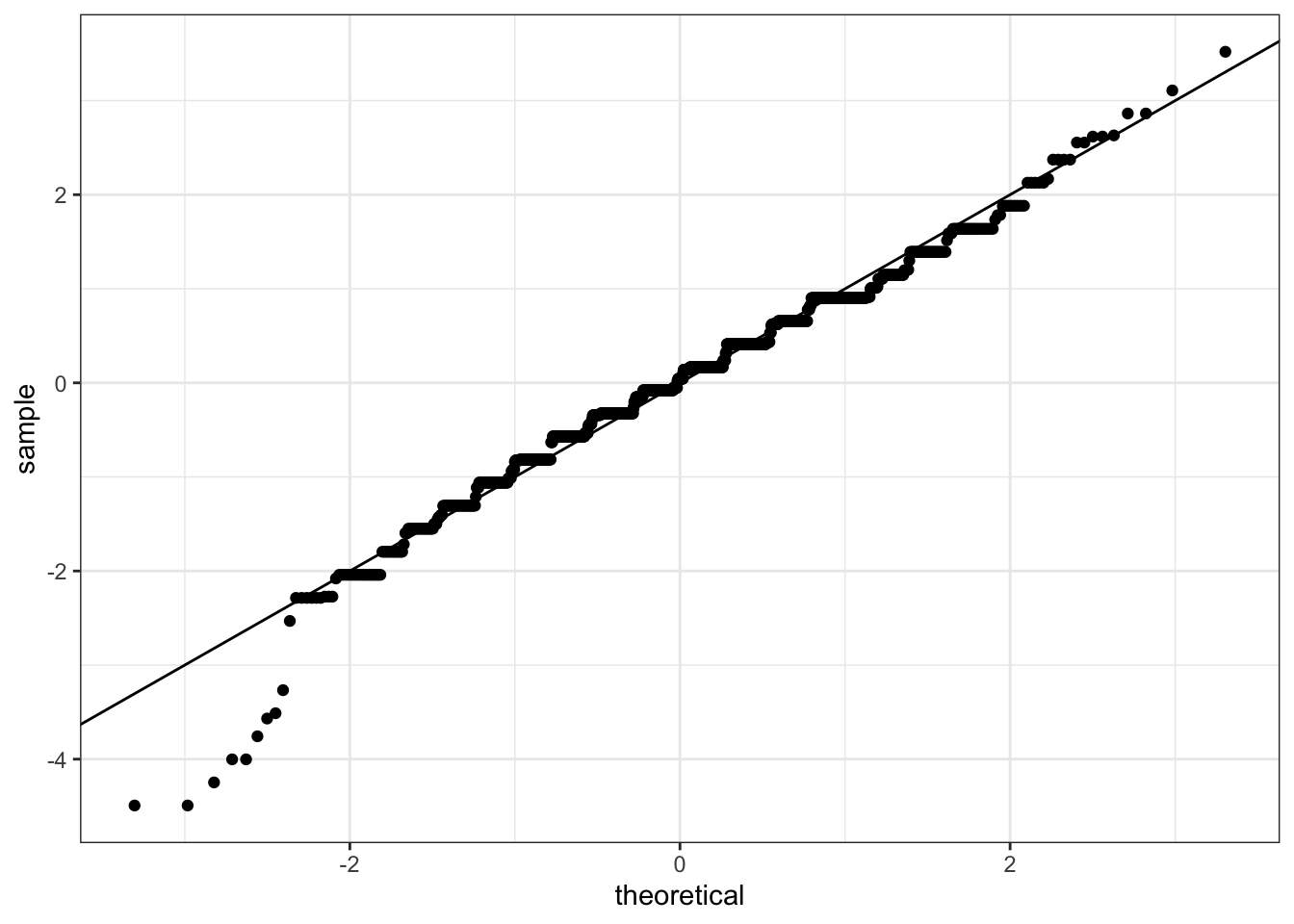
# define plots p1, p2, p3
p <- heights %>% filter(sex == "Male") %>% ggplot(aes(x = height))
p1 <- p + geom_histogram(binwidth = 1, fill = "blue", col = "black")
p2 <- p + geom_histogram(binwidth = 2, fill = "blue", col = "black")
p3 <- p + geom_histogram(binwidth = 3, fill = "blue", col = "black")
# arrange plots next to each other in 1 row, 3 columns
library(gridExtra)grid.arrange(p1, p2, p3, ncol = 3)